


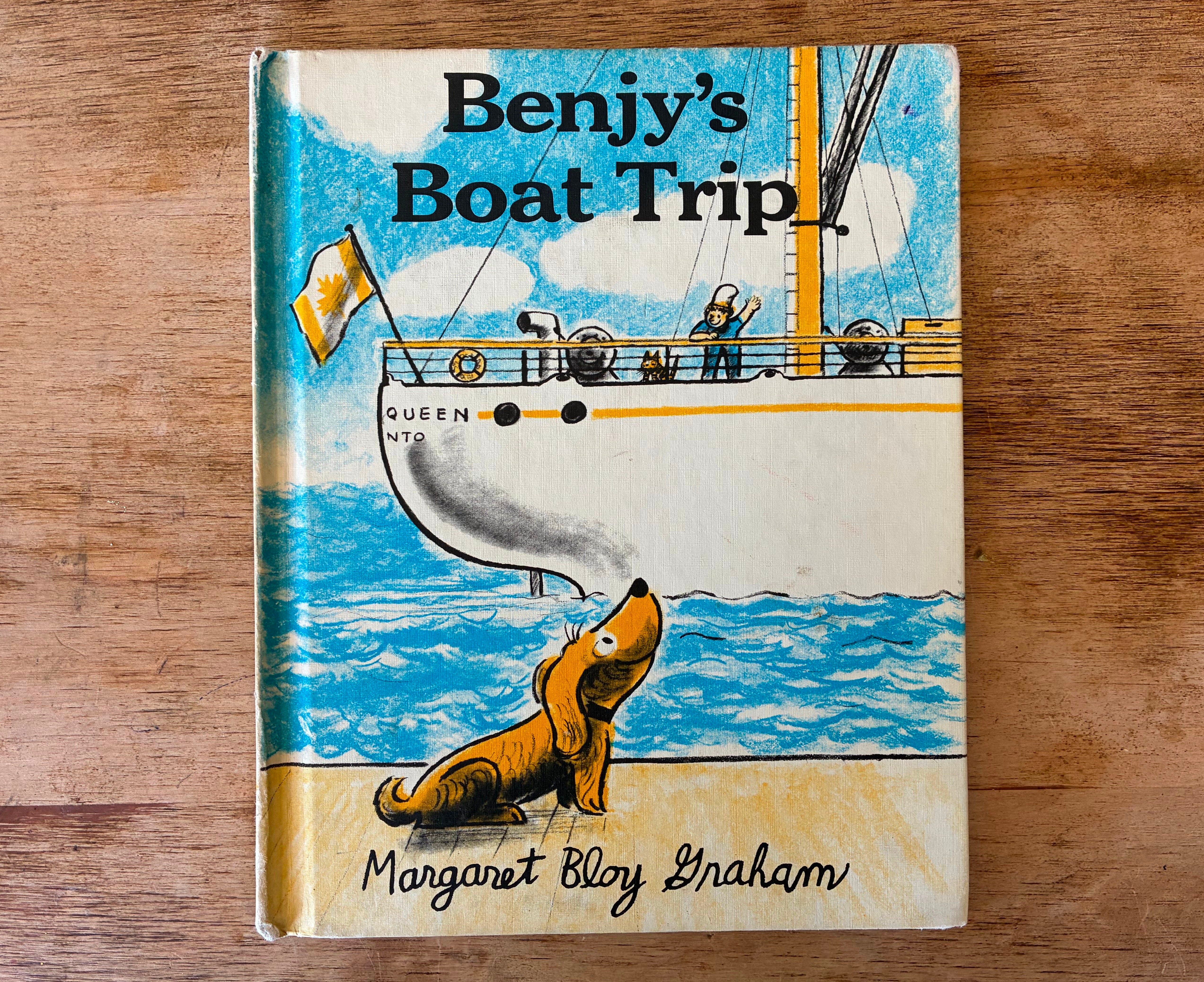
Choosing a Cover Font
c'mon it's actually really fun

I love type and lettering. Maybe more than drawing. I don’t think I have wild taste in fonts or type, but when it’s well excecuted or cleverly-placed, I get just, or even more excited about it than even great illustration. I think great type design can totally save an illustration, and bad type design can almost totally ruin it. This post is mainly a chance to riff on a few popular favorites, but I hope it also proves useful to people who may be new to the idea, or are a little at sea on what their options are.
—JON
The choices of title and corresponding cover illustration are a big deal in the life of a picture book. They can be used to set up the story, introduce who the book is about, or signal what kind of reader the book might be suited to. But a sometimes overlooked and underused tool to enhance all of those things is the typeface itself.
Typefaces are a battleground of culture, whether we know it or not. Look closely at fonts chosen by corporations trying to attract customers from different demographics and watch how their font choices change. Fonts come with built-in meaning and suggestion of allegiances and attitudes that are innate. This can be used for all sorts of purposes, but in picture books it can be aimed at the slightly purer motivation of storytelling.
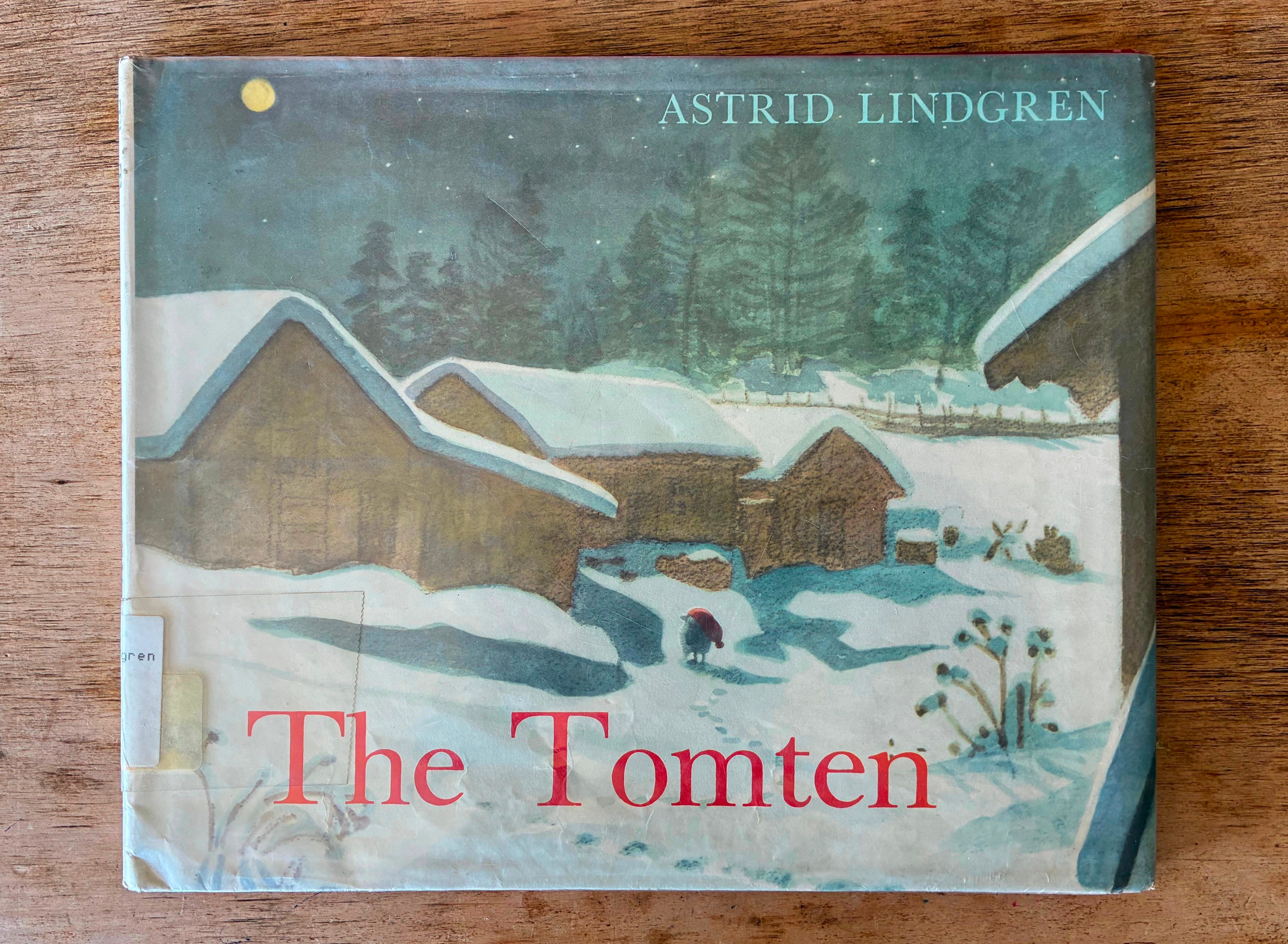
Often a book’s illustrator and also the book’s editor and art director/designer weigh in on the typeface choice. Some illustrators leave the type completely up to their art director, and if you have a good AD, this can be a really great way to collaborate. One of the nicest such collaborations is British author/illustrator Brian Wildsmith and whoever it was that designed the early editions of his books (if anyone knows their name, sound off pls).
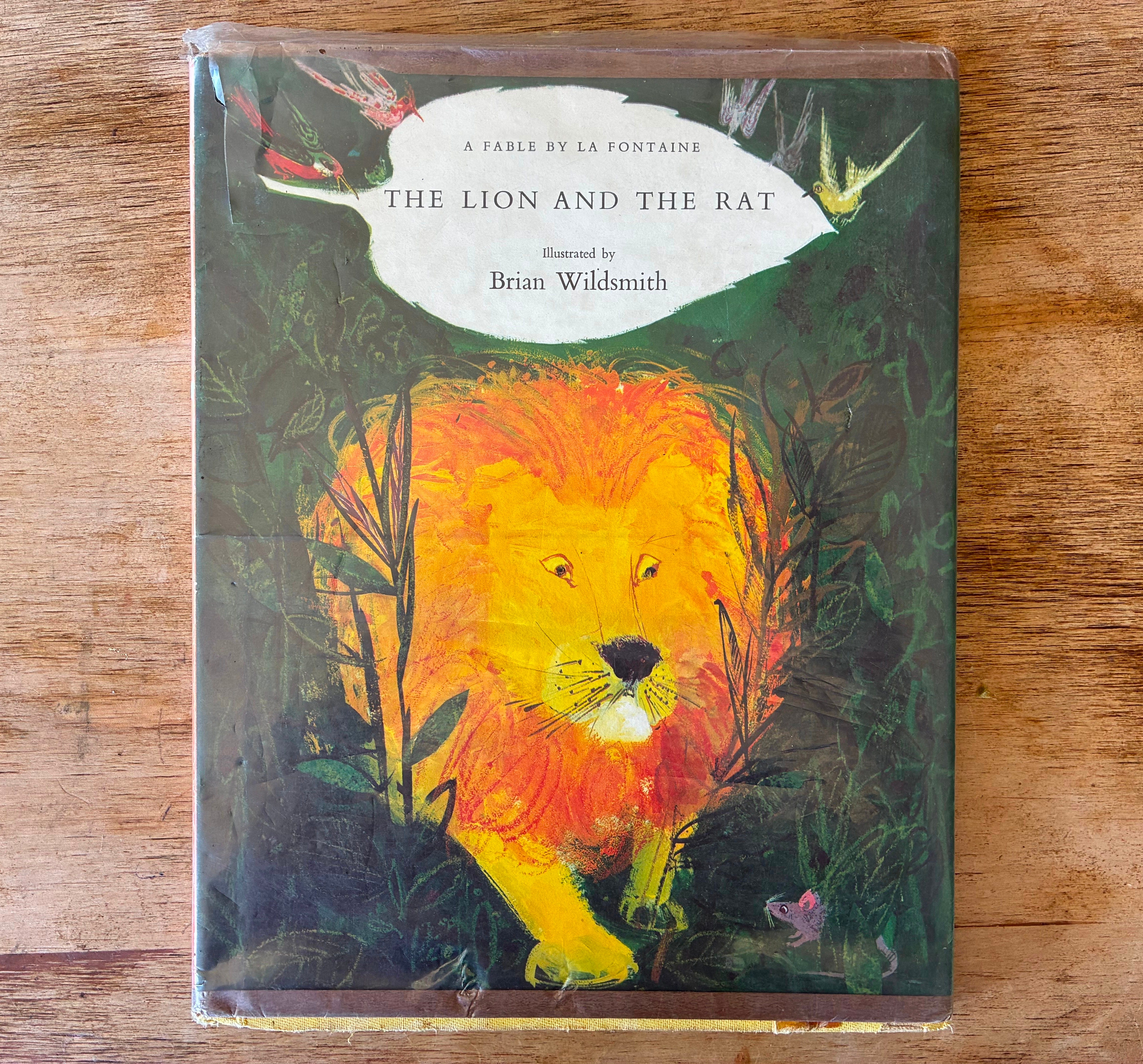
We can learn a lot here. The font is Garamond (pretty sure) and the way it is laid out is conservative and handsome — lots of space, very classy. It’s like a beautiful menu header, or, more appropriately since this is an old fable, a theatre playbill. Maybe some people could think it is TOO withholding to interest children, but a font doesn’t exist in a vacuum: think about where it is going and what it will be seen against. Wildsmith’s art is wildly energetic, full of life and color and spontaneity. It can be downright messy. Put against this artwork, the font and its attitude are such a nice visual surprise, a break for the eye, and, as a bonus, extremely legible. The artwork can give you permission to do this kind of thing with your type (and vice versa!).
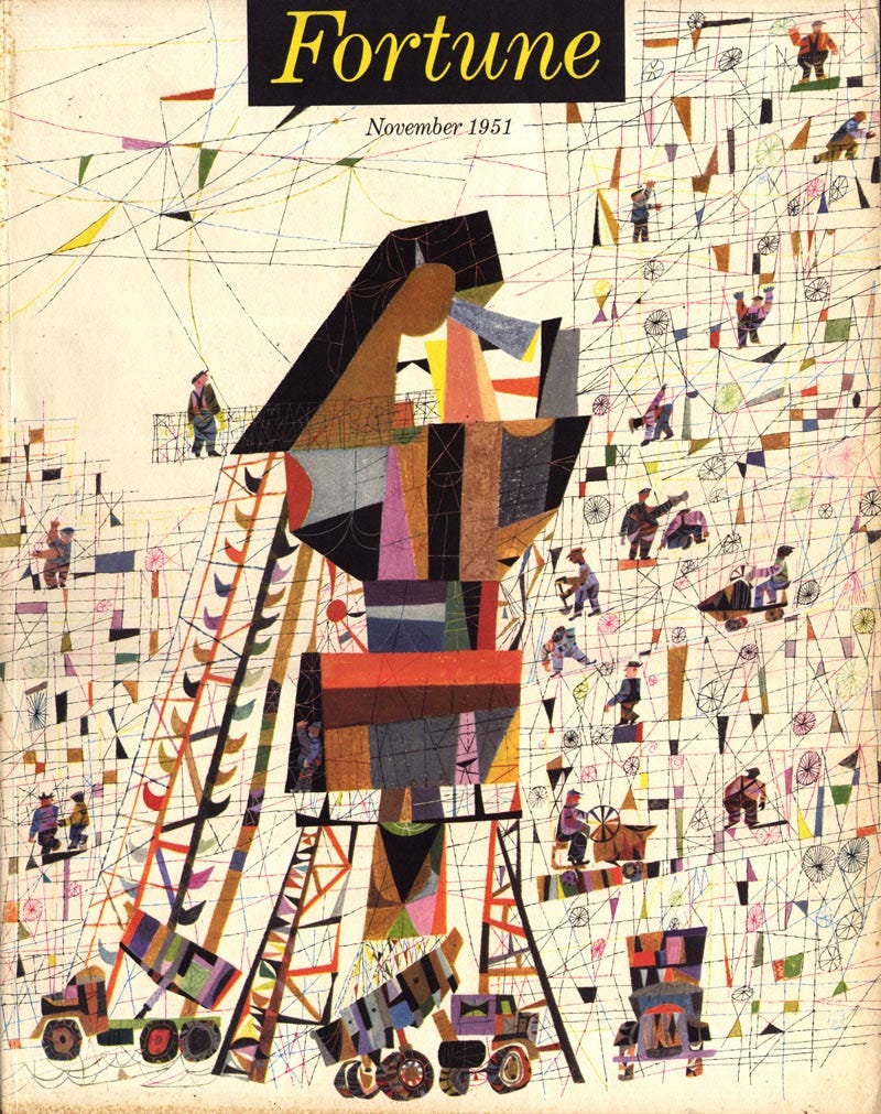
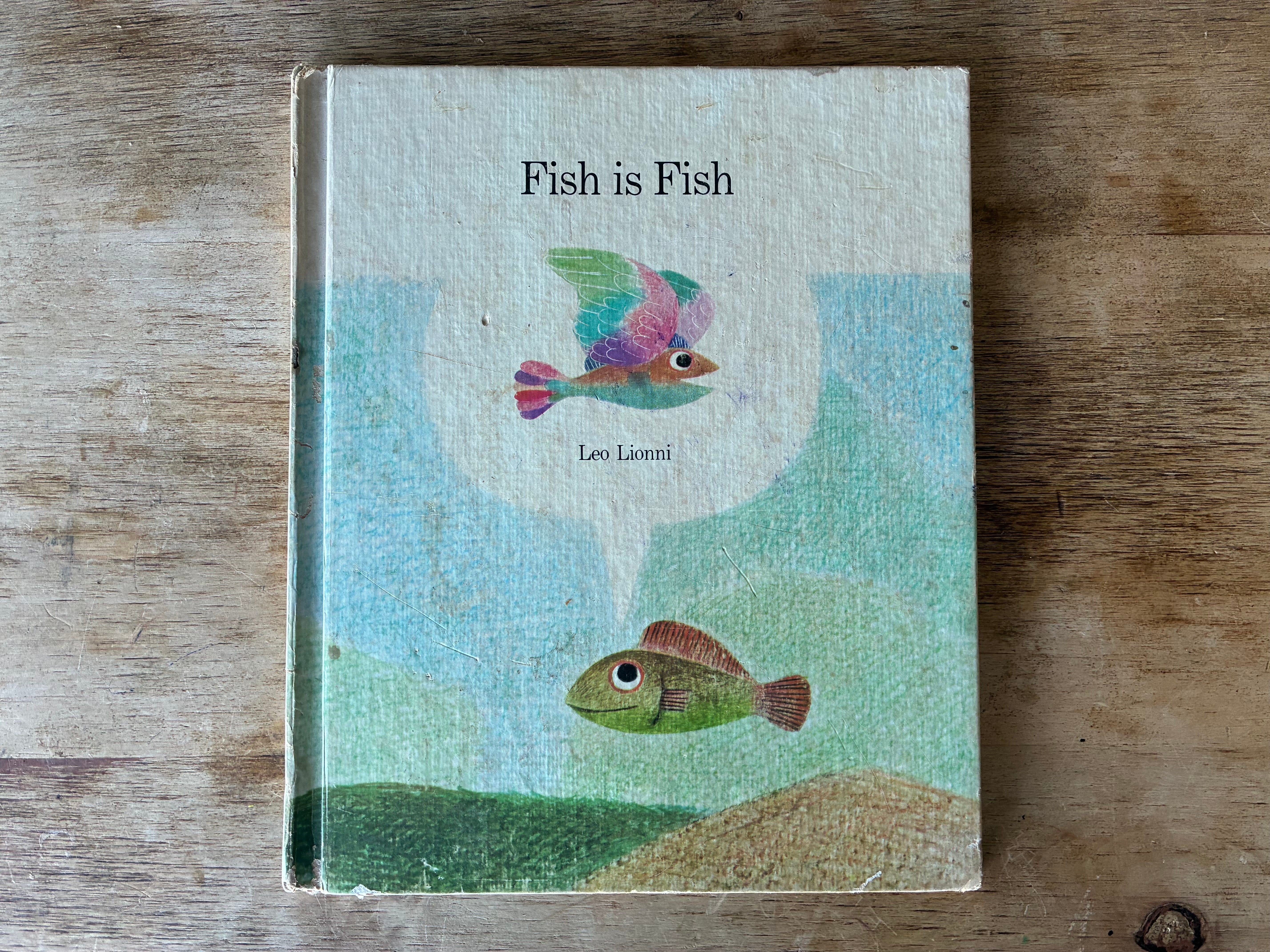
Another great fan of using a grown-up font with expert precision was Leo Lionni. Lionni had been an art director for Fortune Magazine for most of his career when he went into picture books, and it’s rumored that because he knew so much about books and production, he would send in complete picture books, type laid out and ready to print, before his publisher even knew he was working on anything at all. He is actually a great example of an author/illustrator who had something of a “brand” early on. The italicized Garamond on the header was a favorite of his at Fortune…
…and he carried it over very successfully to many (though not all) of his picture books.
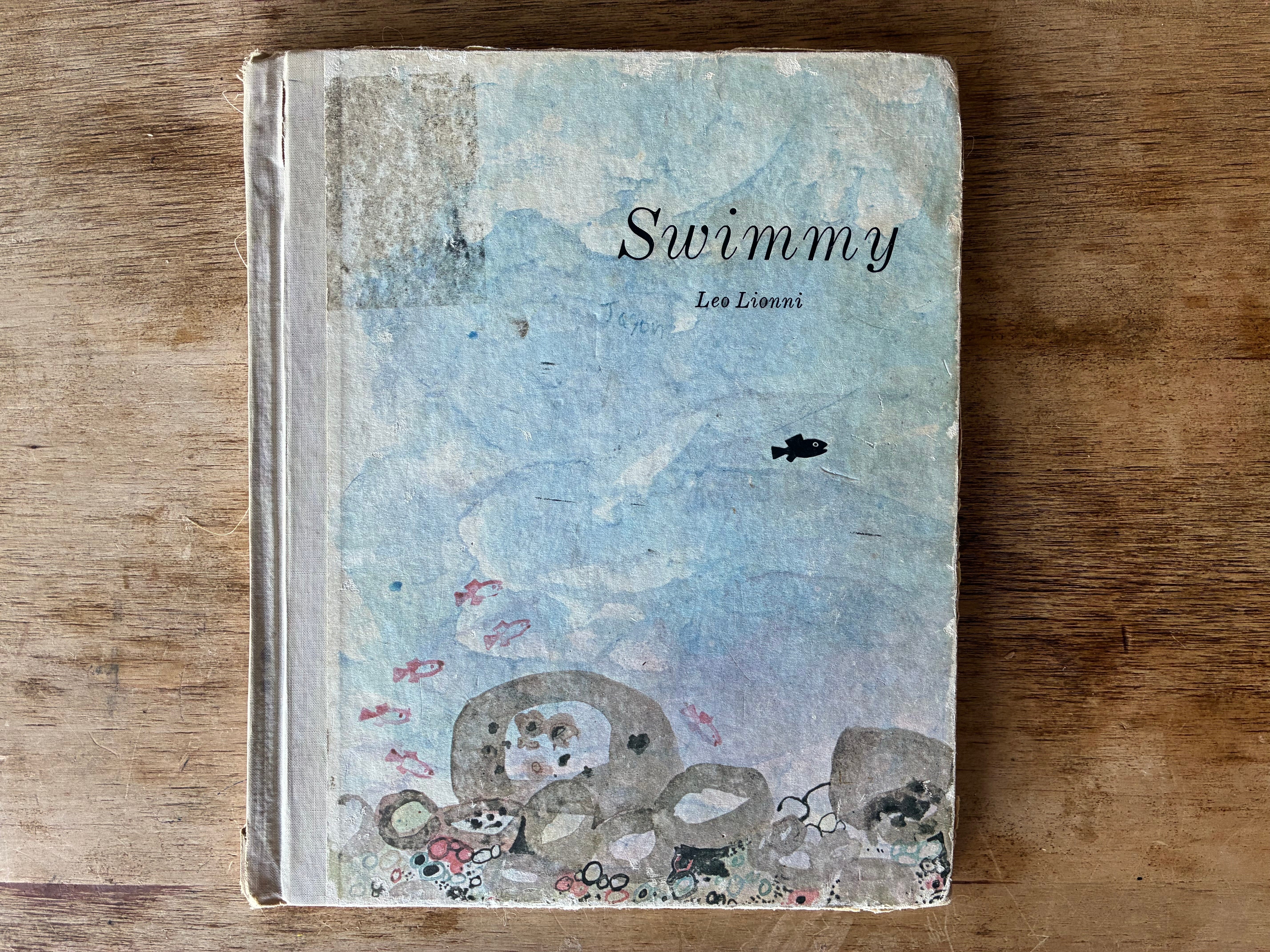
Again, the contrast here is what’s interesting. The font might be too dry if your artwork was too plain, but Lionni is bouncing between the typeface equivalent of a well-tailored Italian suit and, like Wildsmith, loose, vivacious almost childlike artwork. This approach has so many other great examples.
Consider this deep cut:
If you are the type of illustrator who draws letters (and we here at Looking At Picture Books encourage any illustrator to try and draw letters every now and then — it’s a great exercise and actually teaches you a lot about yourself generally. It’s like a little personality test!) you might choose to hand-letter the cover. This has a lot of advantages.
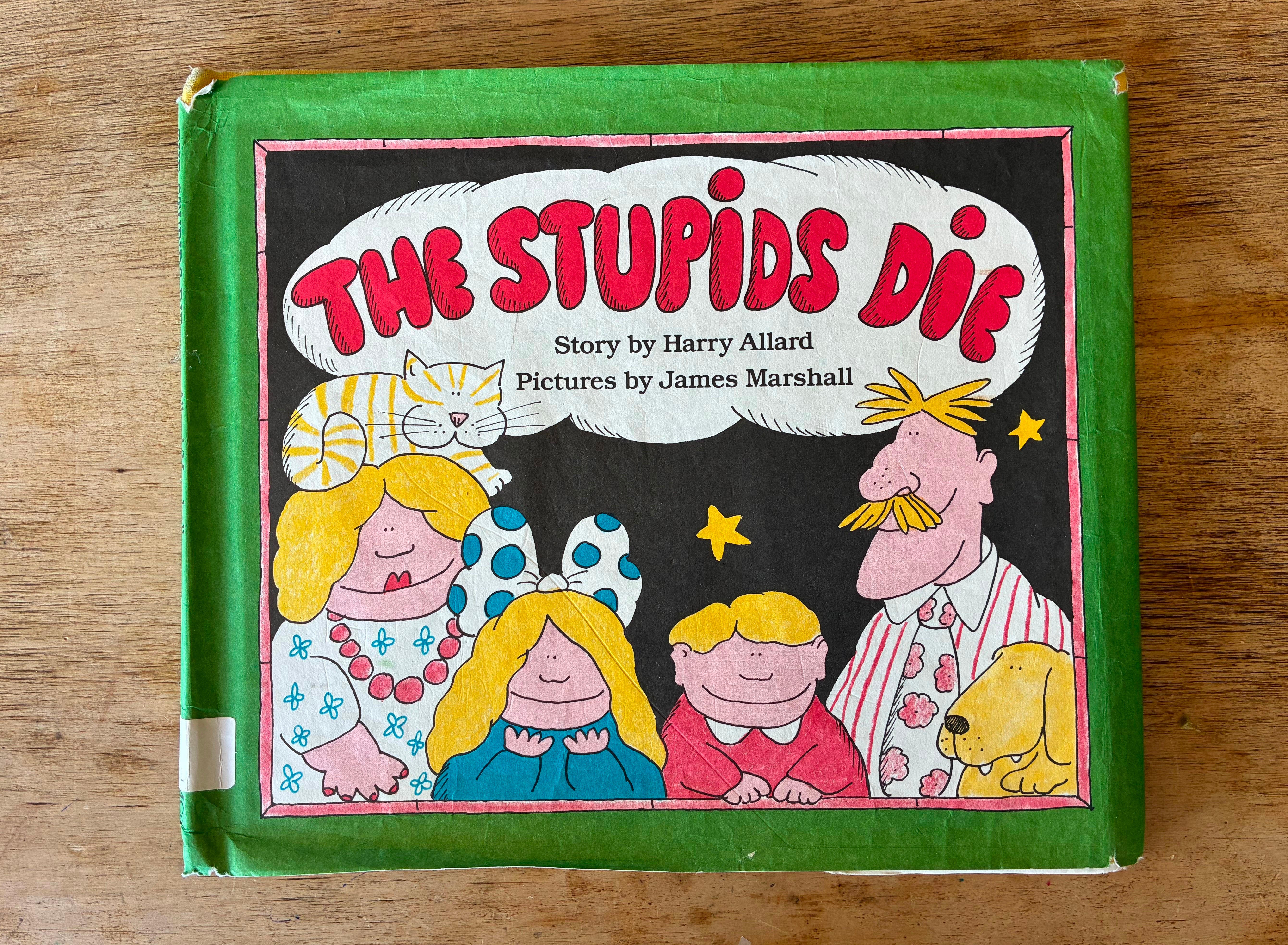
Not only does this look cohesive as one big thing, but the unserious lettering helps to signal that this book will be light and funny. (Though, admittedly the title itself and the drawing do that too, very well… aaand it would also be pretty funny if that title were set in spaced-out Garamond). But that FIRST point is pretty big — finding a “real” typeset font that suits and looks cohesive to the art can be tricky. So, drawing the letters with the same attitude and even materials that you use to make the art kind of guarantees an overall look that feels singular, probably.
If you want the warmth and approachability of a hand-drawn font but aren’t as funny as James Marshall (and you for sure are not), a nice option is hand-lettering BUT with a kind of a serious intention — no wacky angles or bubbles or anything. Basically, trying for straight lines and even spacing between the letters, but counting on the fact that they won’t be completely perfect, so it still feels human.
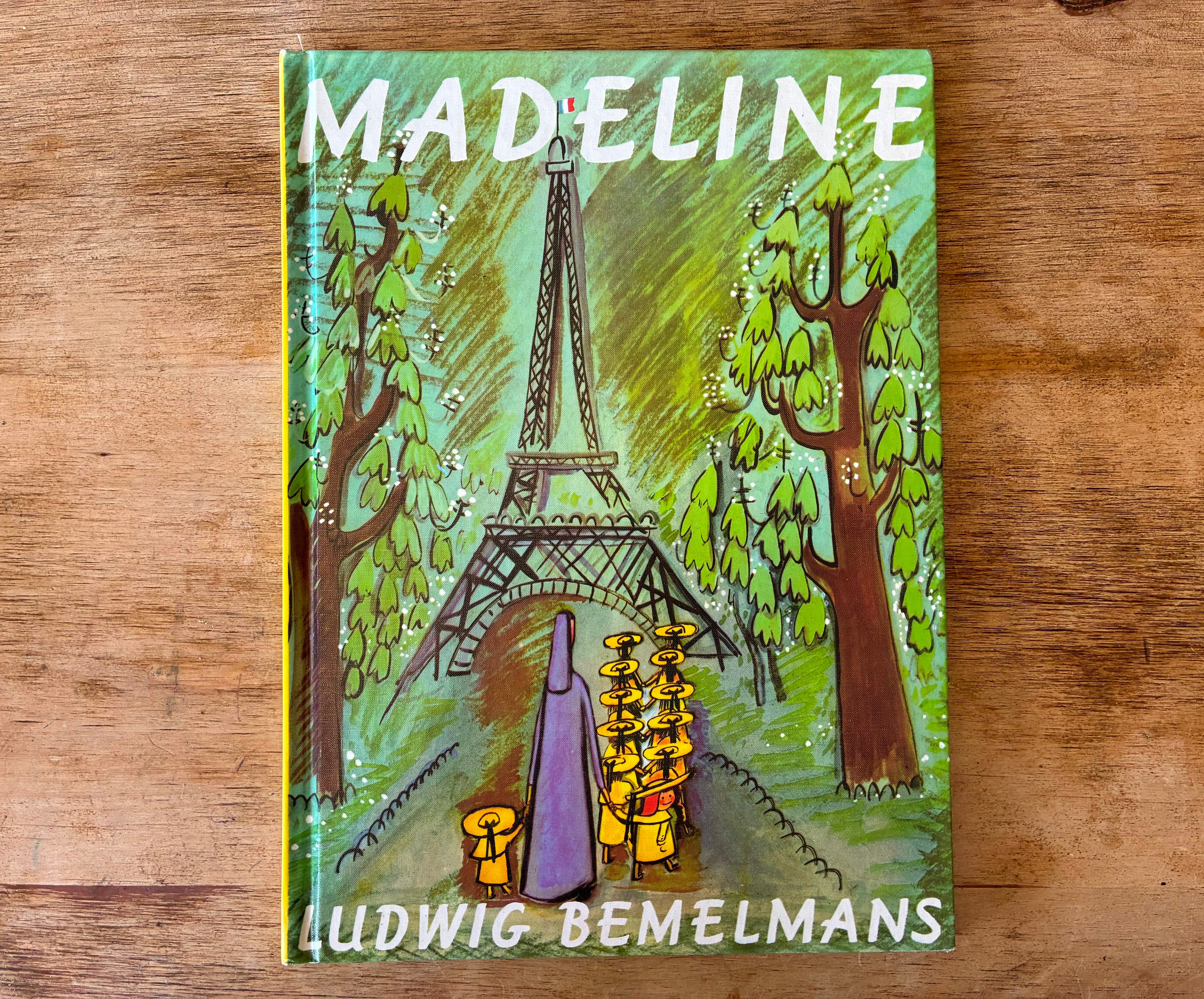
(This is another one where if anyone knows for sure if Bemelmans did the lettering here, pls let us KNOW).
This font-recipe also has a lot more classic examples:
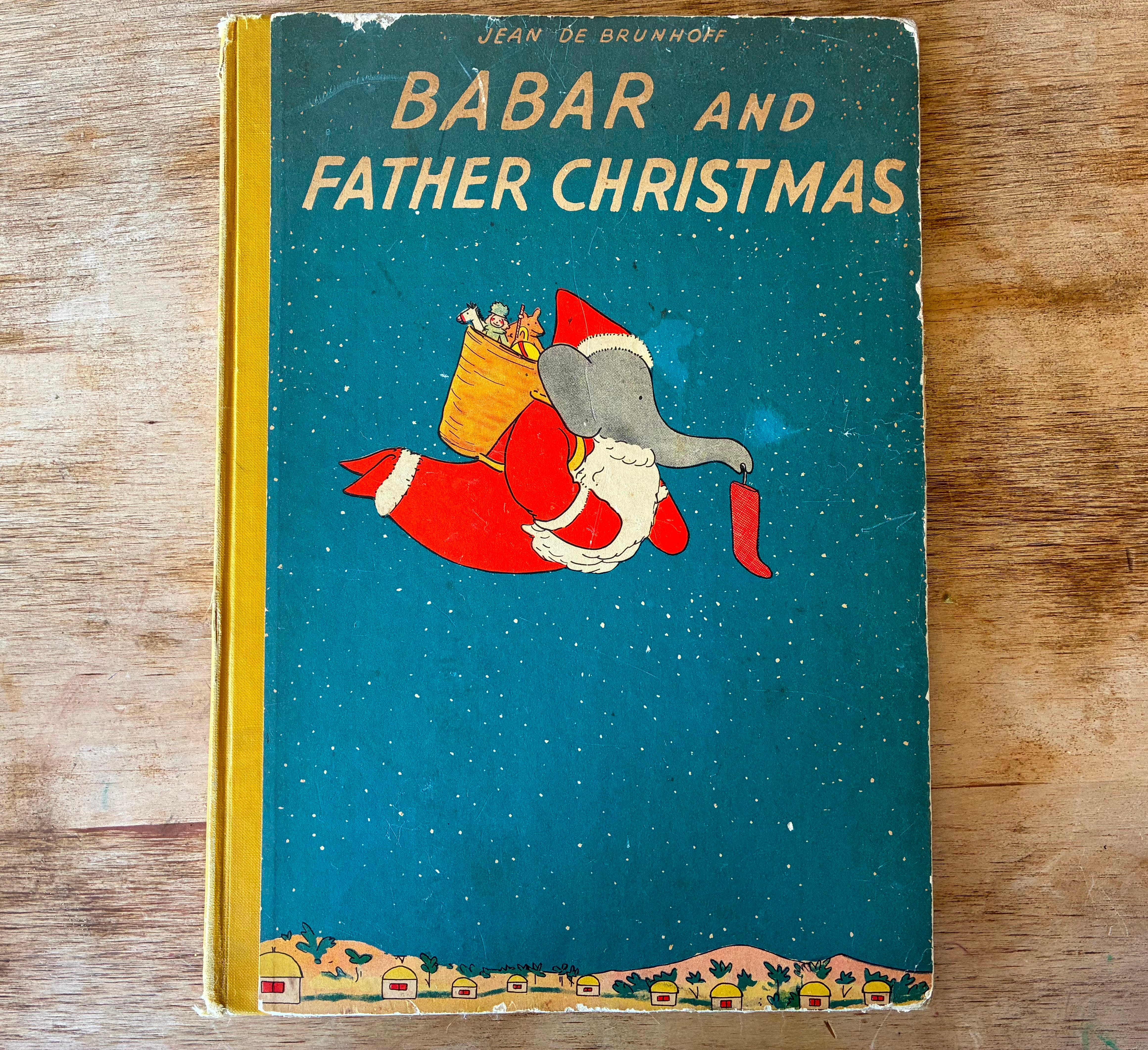
Or OR you can do a combo — typeset the title, hand-letter the credit:
Very nice.
If you are looking at all of these and thinking: “Gosh, my artwork isn’t childlike at all. Plus I can’t/won’t draw letters. I’ve just got the handsomest artwork ever and I just want to be handsome.” Well, congratulations, and good news: a lot of people in your position have been very happy with typeset all-caps serifs (serifs being when the letters have those little hats on them and often go thick/thin in their vertical and horizontal lines).
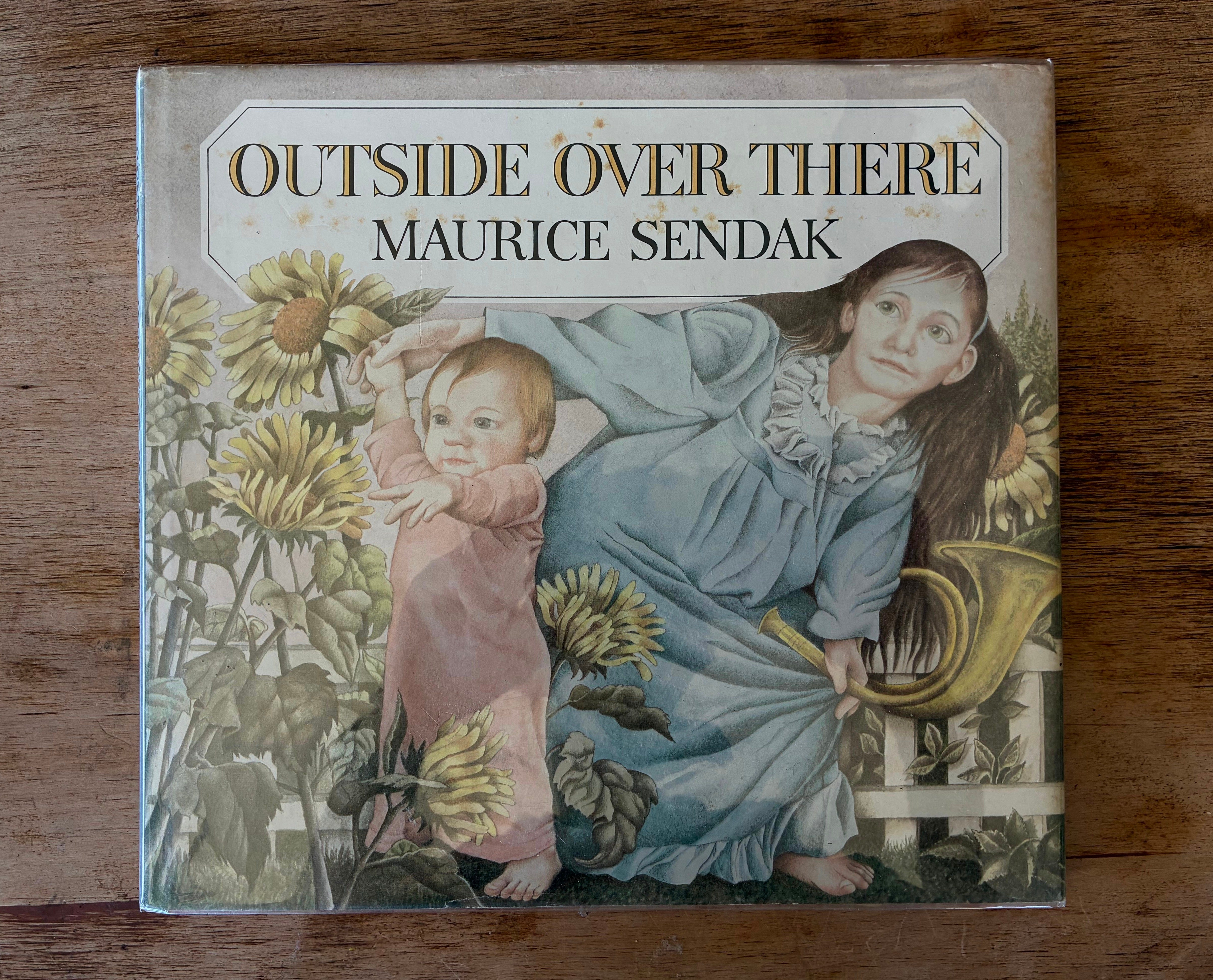
All-caps serifs are, often, a flex. It’s a way of saying: “I’m going for it on this one.” Some people, like Sendak, only used it when the book, for him, was shooting its shot (and that one certainly was).
Other people use it exclusively for ALL their books because their whole thing is that they are always “going for it.” Case in point:
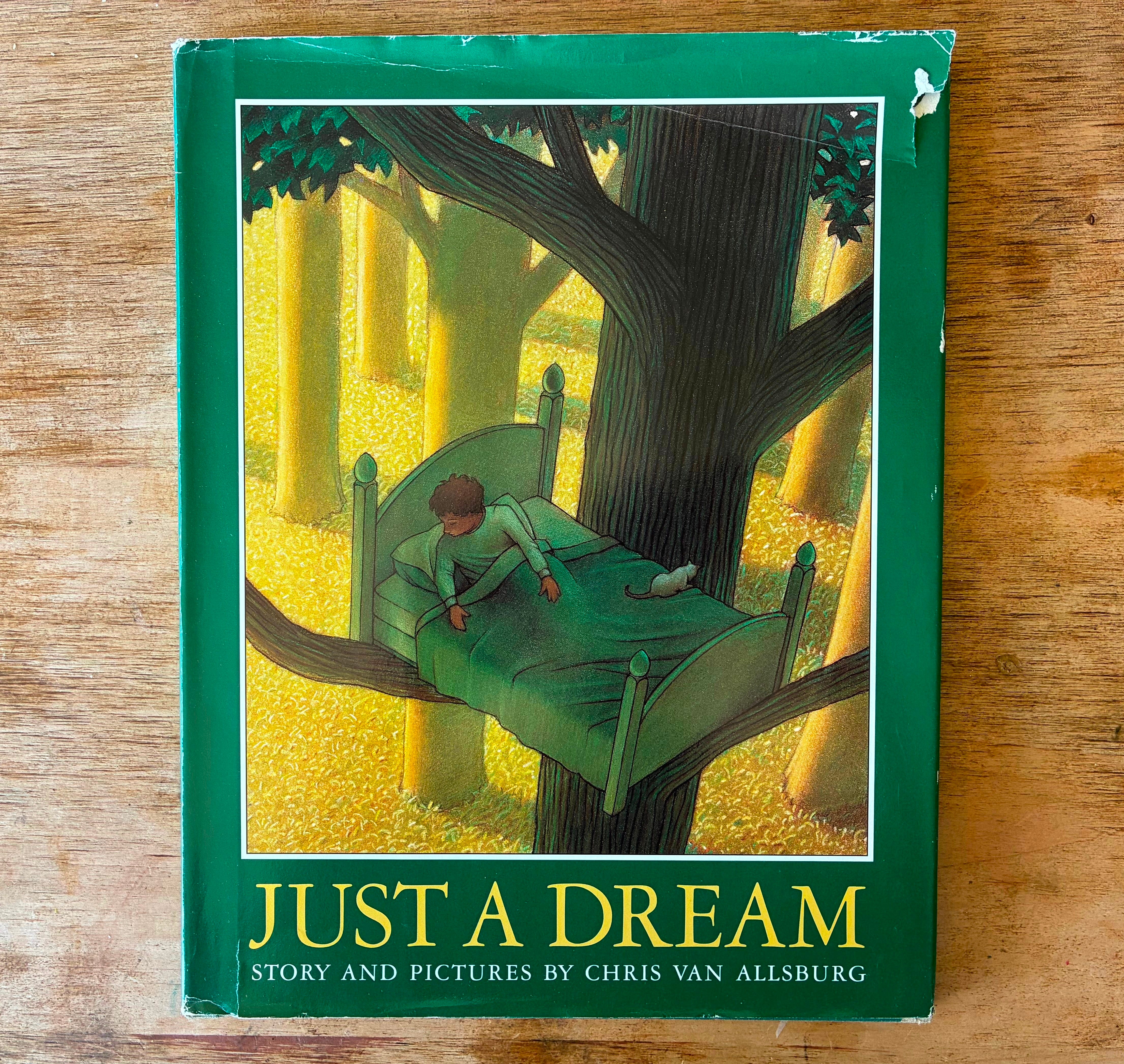
Never was anyone so suited to all-caps serif titles than Van Allsburg. He owned this look so hard you can’t even use this kind of type anymore unless you can render an elephant to photographic accuracy using nothing but a Ticonderoga pencil.
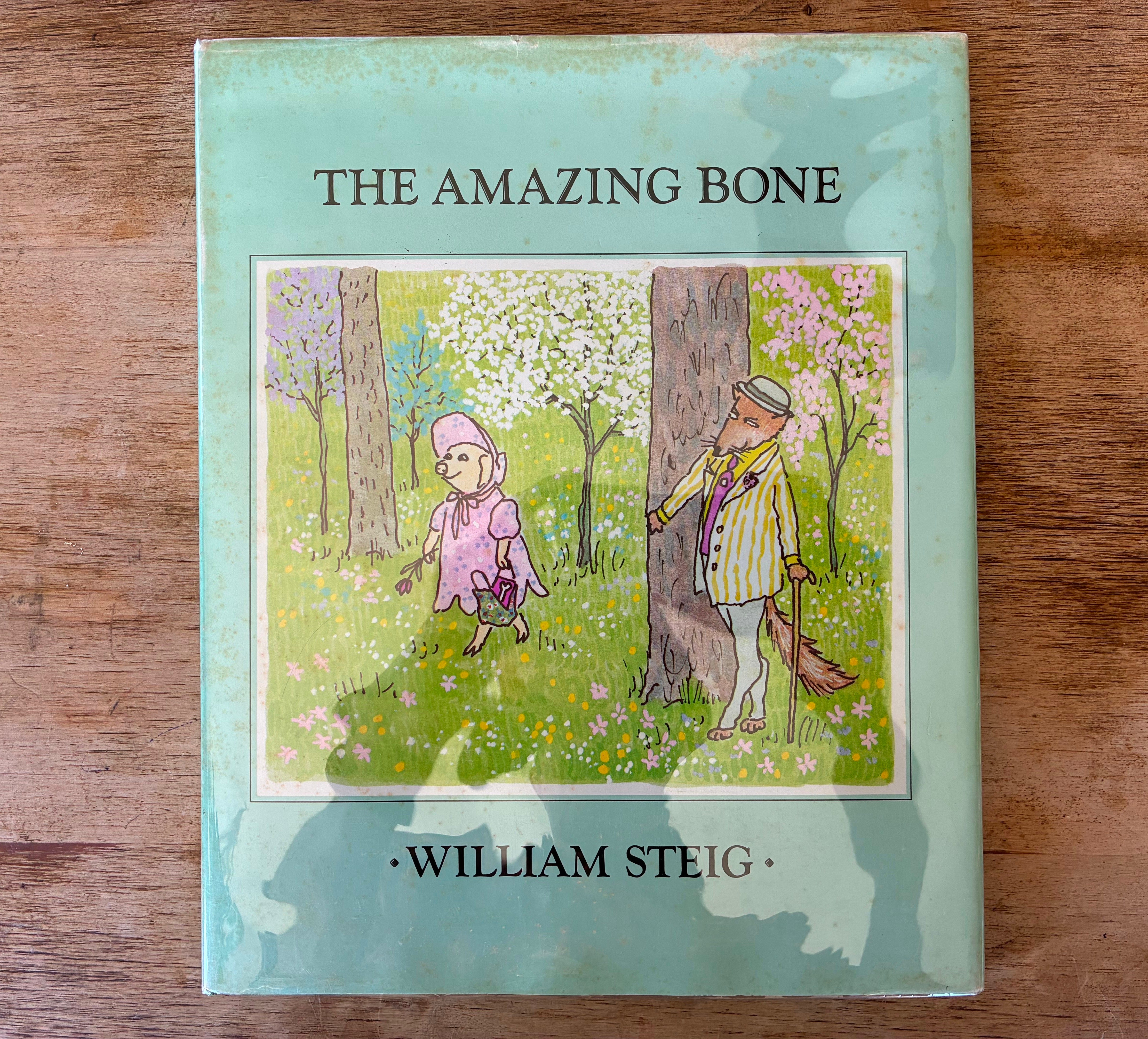
One way you might use it and not look so declarative is if you shrink the letters down a little. Still handsome, but not as flex-y, somehow (though Steig had every right to be).
Or, go for upper AND lower-case serifs, to be a little humbler, if your story is handsome but also just about a cutie being a cutie in the world (and watching farm animals and children sleep terrifyingly from the shadows).
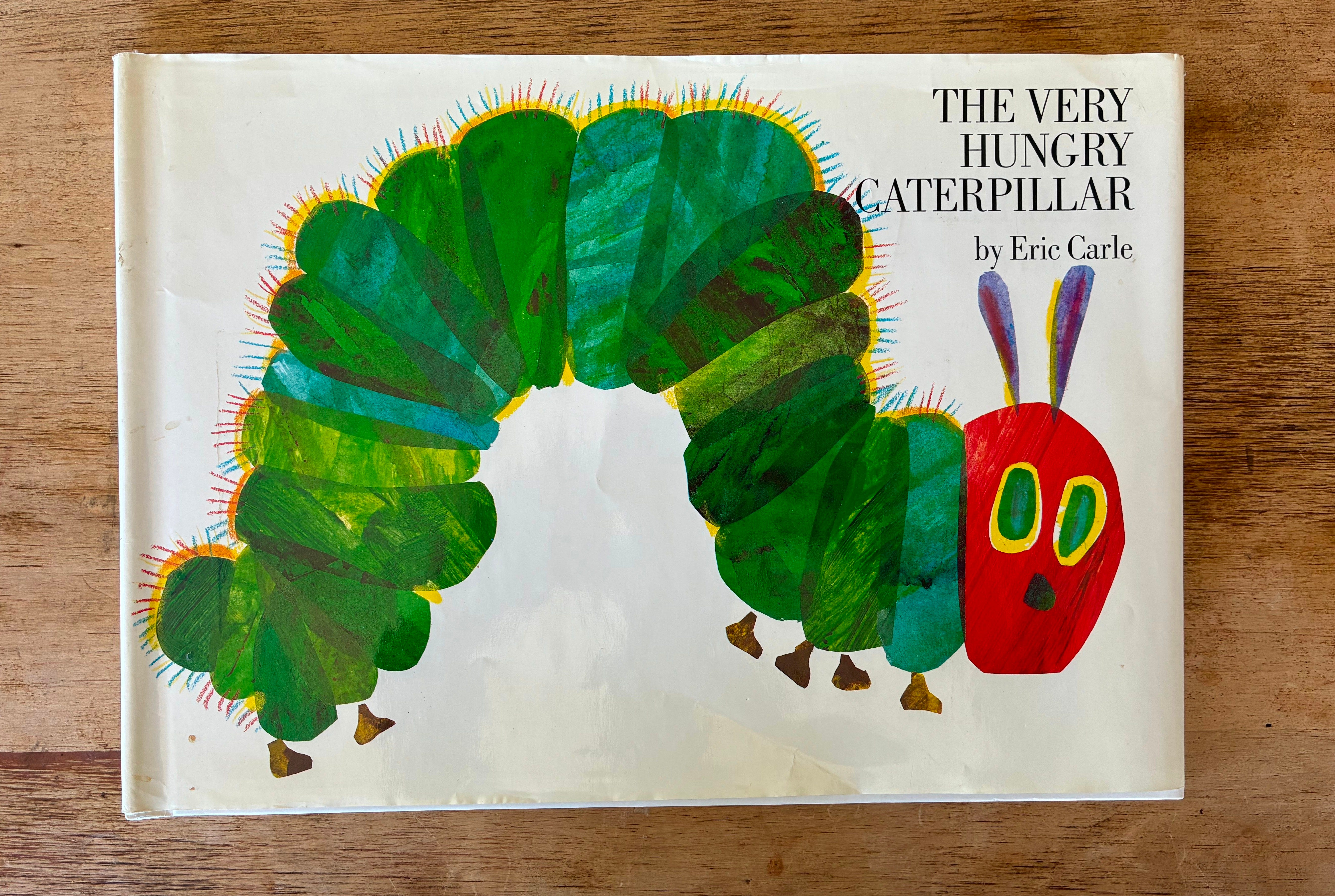
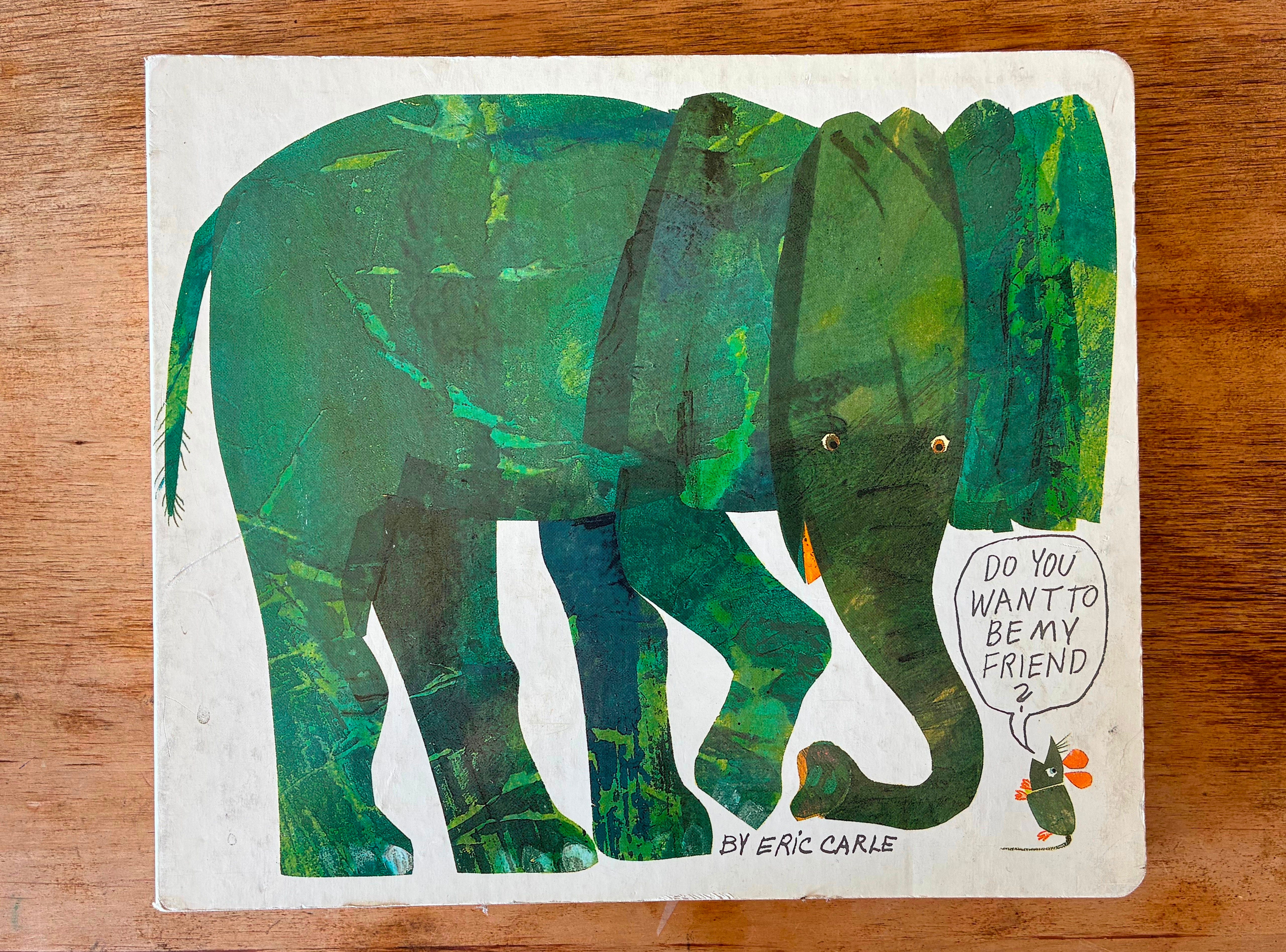
It’s good to remember that, whatever you choose, it doesn’t mean you’re stuck with it for every book always. A lot of people jumped around, book to book. Eric Carle, as we saw, was very well known for pitch-perfect, kind of serious typesetting next to his art, but he could hand-letter with the best of them when he wanted to.
Leo Lionni used that italicized Garamond for his whole life, but some of his best books deviate from it, at least a little.
The main thing in all of this is to make sure the lettering choice is treated as a tool with a job to do, either separate from the art or at least supporting it in its own way. Similarly to how we talk about illustrations inside the book holding part of the story and the words holding another part, the art on the cover can be only half the attitude you want to put forward, and your type choice can be the other half.
Just don’t copy the Van Allsburg look. He’s got that sewn up tight.
I was reading Leo Lionni books all week long in my elementary school library, since it was his birthday on Monday. As a result, his typeface and text placement was on my mind from the moment I saw the title of this post. Can I diverge from the focus here on cover lettering to ask a question about type within the pages of the book? One thing I noticed this week was the terrible (can I say that about such an amazing piece of work? Yes, I’m going to say it…) the terrible way the text is laid out in Little Blue and Little Yellow. On one or two pages, the text literally runs right into the gutter. Now, I fully understand that a large part of this is the limitations on printing techniques back then. And it might also be partly because I was reading an ancient Perma-Bound copy that we still have in the library. But still - the layout of the text feels like an afterthought. I’d expect more from anyone, and particularly Leo Lionni. Care to comment? What are your thoughts?
I dipped a toe into drawing the title font for a book I’m nearly finished with and it was scary and exhilarating and I may be hooked. Previously thought it just wasn’t my lane!