


The Little House
Jon & Mac consider: anthropomorphism, book design, the creative trials of Quincy Jones, the dilation of time, a newish picture book (for once, but only briefly), ellipses, Twitter urbanists, restraint


Today we’re looking at The Little House by Virginia Lee Burton. You can read our conversations about other picture books, including Where the Wild Things Are and Goodnight Moon, here.
The Looking at Picture Books Shop has totes and posters.

Virginia Lee Burton liked trains. Her first book was Choo Choo, about a train engine, and it’s a subject she went back to often in her work.

Trains are a preoccupation of many famous children’s storytellers. As we’ve seen, Donald Crews was a big fan. Walt Disney, and in fact a lot of his animators, were train fanatics. A few of them built rideable miniature trains on their properties, and Disney himself built his own in a little theme park he had in Southern California. It’s not a stretch to say there’s an overlap between the idea of trains and storytelling. To a certain extent, storytelling is setting up a world like a model train set, pressing “go,” and watching your reader ride the story itself along an intended path that has been designed with variation, rises, and falls. If you’re lucky, the whole thing feels alive.
If The Little House is a train set, the train moving through it is time itself. Here, instead of a plot, we’re moving through time. It’s a world reduced to its essential elements, and the simplicity of the parts allows us to mark the changes and see it evolve in its miniature way, always from the same vantage point (until the very end). It is a sequential idea, rather than a series of disconnected illustration ideas, and it is a masterpiece of storytelling, pathos, and book design.
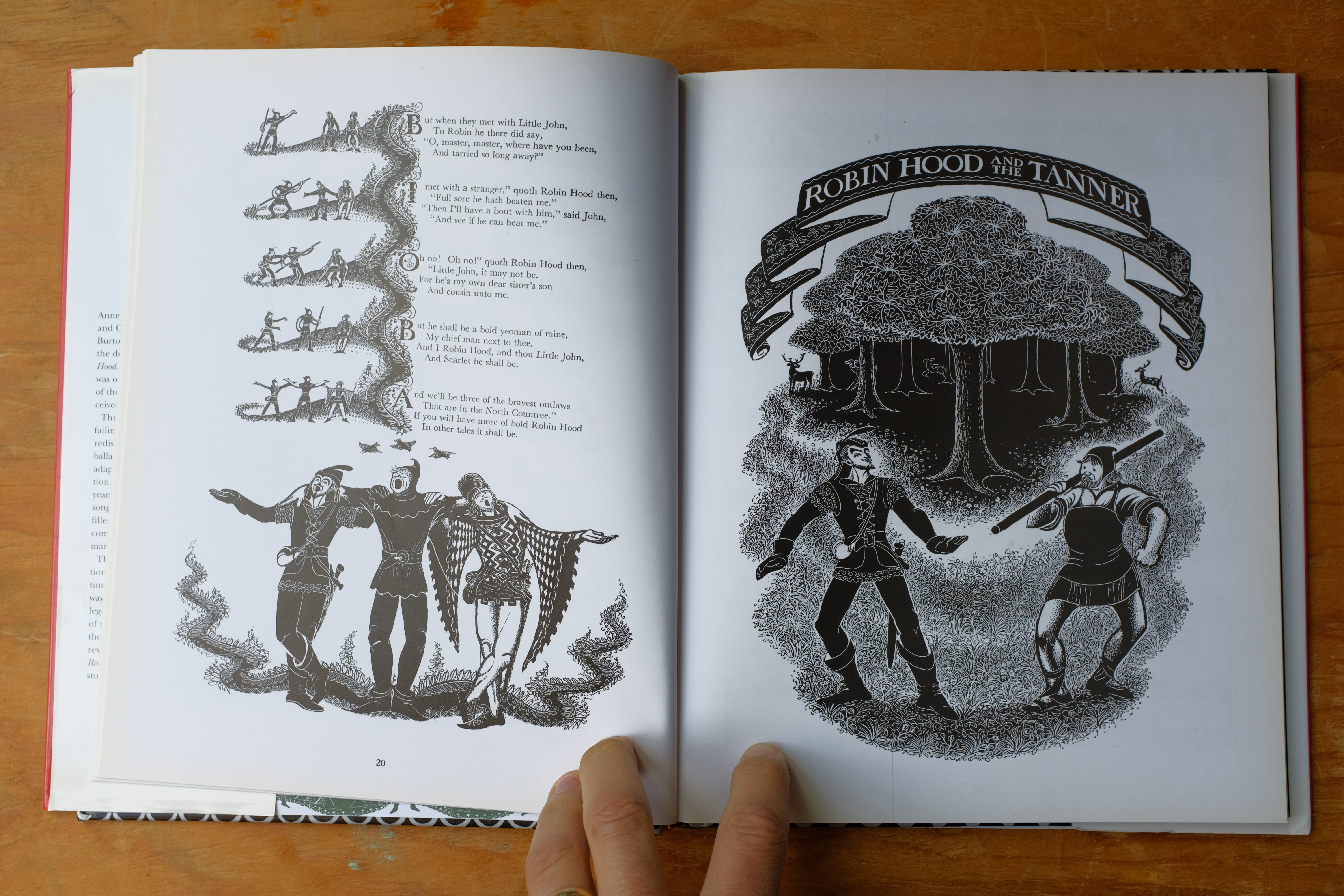
Burton was, among many other things, one of the best book designers to ever do it (if you don’t know it, check out the insanity that is The Song of Robin Hood). She approached books as a whole using every available ingredient, from the text design to decorative borders and vignettes, to not only enhance the mood and beauty of the object, but also to have that decoration further the narrative.
Burton’s stories are often preoccupied with a changing world. She is from a generation that saw the rise of American cities, and her reaction is a complex one. She is obviously fascinated with the scale and texture that these new places had, and the new machines that could shape and form the earth, but there was also a sadness to her fascination, a sadness about what was being lost. Sometimes her books just describe this time and these machines as a phenomenon, focusing on a character inside of it rather than how she feels about the transformation happening in the background, but The Little House is less vague on this point. The city, in this book, pretty clearly, isn’t great!
Mac and I had this conversation over text.
—JON
MAC: Hi Jon.
JON: Hi Mac.
MAC: So The Little House, winner of the Caldecott Medal, written and illustrated by Virginia Lee Burton, published in 1942. Lemme start with a question you’ve asked me a couple of times on here: Was this a big one for you? Because it’s about an inanimate, immobile object that has eyes and a mouth but doesn’t really express itself much emotionally. Feels like you would have been excited.
JON: Yes. I don’t remember where I would’ve seen it, we didn’t have it in our house, but it stuck in my head really hard. I think it informed a lot of what I like or at least like to make in my own stories. I'm really jealous of this book, for so many reasons.
Even when I was little, inanimate objects were SUPER emotional for me. That’s probably true of a lot of kids? But I don’t think I nailed it down as a thing I wanted to use creatively until later, when I just kept wanting to not draw emotion. I would seek out stories that had gotten around it, somehow. And the better examples of it were always actually really powerful BECAUSE of that conceit, instead of just getting away with it.
MAC: Should we look at the cover?

It reminds me of a piece of needlepoint, or some traditional American craft.
JON: Yeah Burton actually founded a design and textile collective, The Folly Cove Designers, in her town that made decorative arts. That was her jam.
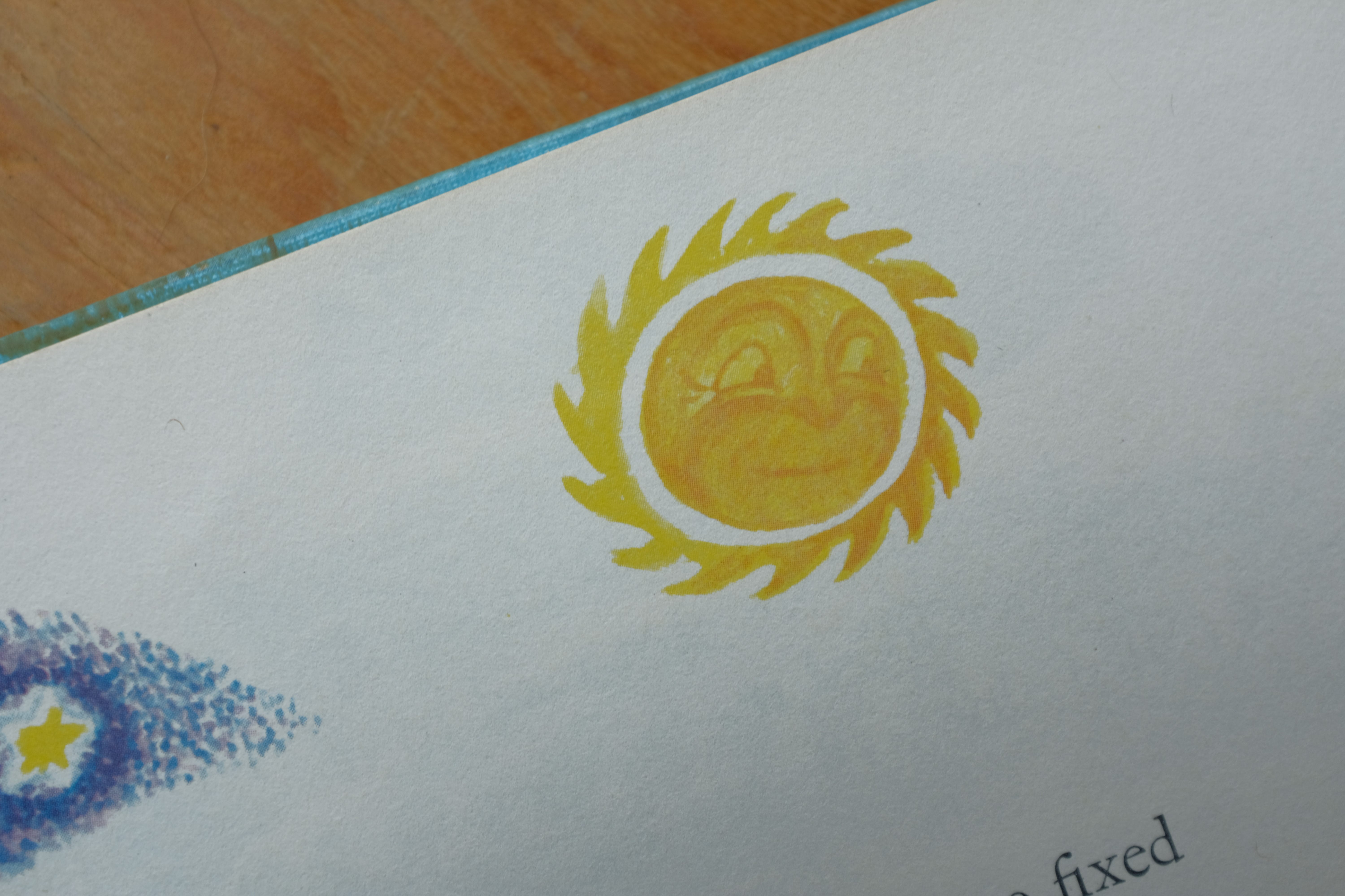
MAC: There’s that winking sun, which feels very Disney.
The sun has more facial range than the house.
JON: There’s actually a ton of Disney overlap here. I think she was a really big influence on the artists at the studio, and she herself has a ton of sequential art that looks like animated frames. She was working when the Disney studio was coming up in a huge way, and her books were very popular. For sure they were aware of each other.
But yeah, the sun is basically the only one in the book who really emotes at all. The people in the story are too small, and the house is a very interesting design that KIND of gives off some emotion. As the book goes on, it’s unclear how she’s feeling, but even the small amount of range that the house does have is enough to prompt you to look HARD for changes in her “face” the whole way along.
MAC: And then there’s this unofficial subtitle, which is abandoned by the title page and doesn’t appear in the cataloging data, but shows up on the path leading up to the front door: HER-STORY.
Was Virginia Lee Burton in on the ground floor of the “her-story/history” pun?
Evidence for:
The hyphen.
Otherwise you'd just say “HER STORY,” right?
JON:
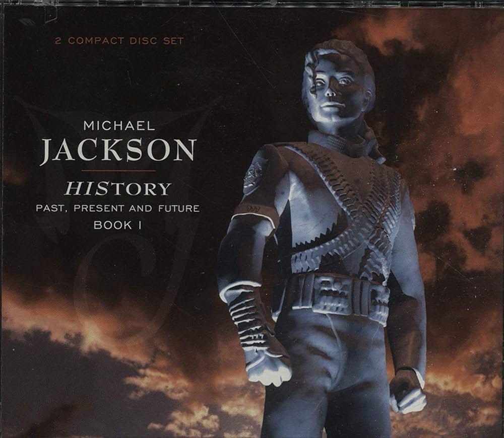
MAC: Man.
Michael.
“Finally, I'm putting the “his” in history.”
JON: “Finishing the war that that book lady started.”
MAC: His first pitch was probably “MESTORY.”
And some poor record exec has to be like “Michael, the joke’s not reading.”
JON: Quincy Jones rubbing his temples at the end of conference table.
MAC: ANYWAY.
JON: Anyway.
MAC: I do think that Burton conceives of this as both a story about this little house and a history of American industrialization and urbanization.
There’s probably a good thesis about Burton’s gendering of the domestic/pastoral vs. a capitalistic mechanized modernity. Please thank us in the acknowledgments.
“Thanks to these two great guys, Mac & Jon.”
JON: Plenty more where that came from, everyone.
JON: Right away, just gotta say — great, great typesetting. Love that path type.
MAC: You mean the placement?
Putting it in the white space in the path?
JON: Yes. The placement in the path.
path type.
you know.
MAC: Right. Of course. Sorry.
This gets to your point about her being a great designer though. When making her illustration she planned a place to put the text.
Not every illustrator does this!
But she will soon revert to a very formal, classic layout — text on the left, illustration on the right — that she’ll use for the first chunk of the book. This is the only part of the “pastoral” section where the main illustration and the text share a page, and you can see that she wanted to find a solution to that problem.
JON: And even when it gets more straightforward later, she’s still very playful with her indentations and paragraphs. It looks often like a songbook or verse rather than a paragraph in a story.
MAC: This kind of fluid interplay between typeset text and image is what Wanda Gág wanted to achieve in Millions of Cats and couldn’t (which is why that book is hand-lettered). You can see the advance of printing technology in the intervening decade, and also the lasting influence of Gág’s design ideas.
Industrial progress! Good for book design, terrible for little houses.
JON: I wonder if Gág saw this and was happy or pissed.
Next page:
Here’s that sun again. Emoting the hell out of himself.
MAC: He’s so wacky!
Look at that yawning sun, at sunset. It’s such a silly gag!
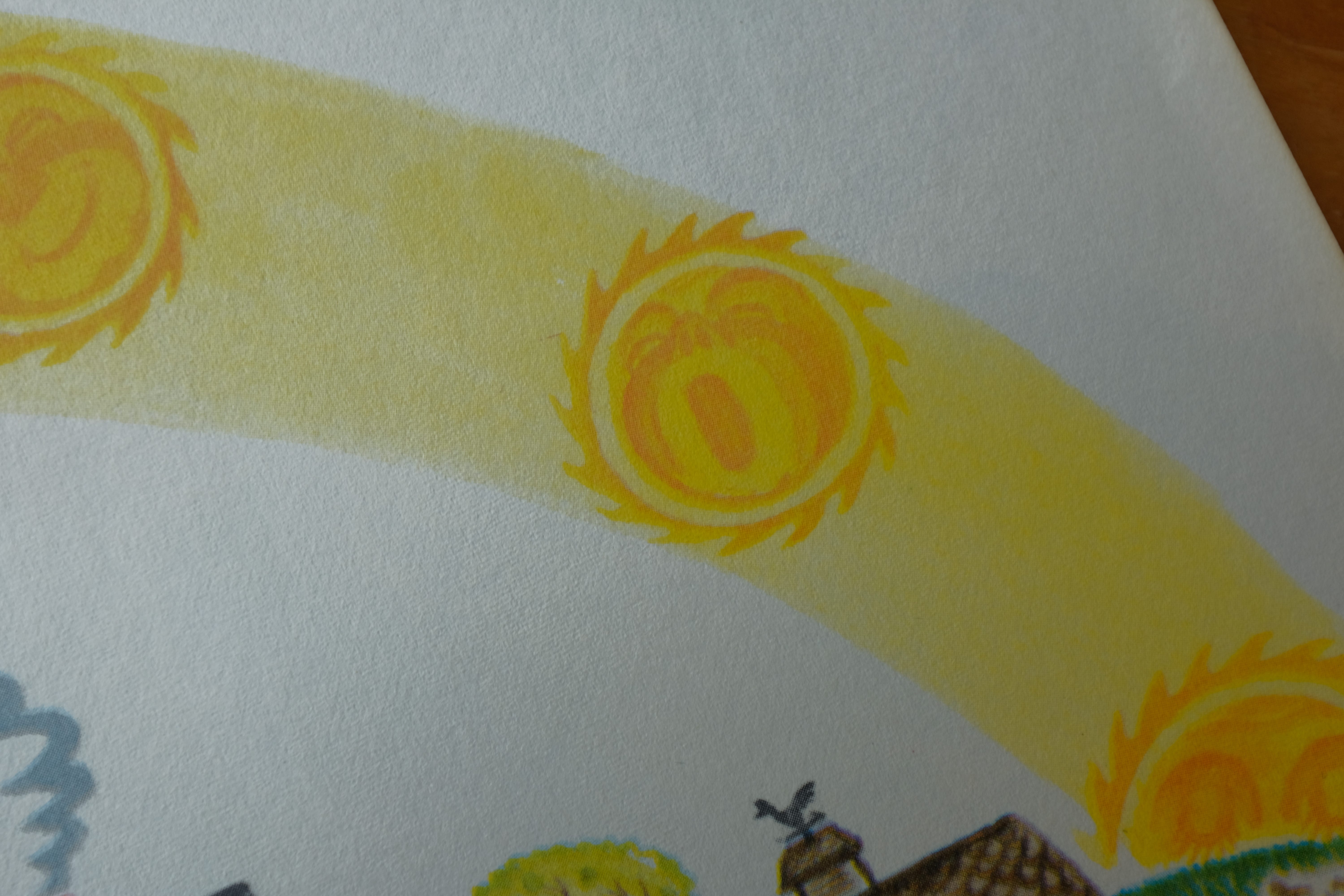
He is the main character of a much worse book.
The Little Sun.
JON: Quincy Jones rubbing his temples at the sun.
MAC: OK, so it’s worth reiterating here that Burton has settled into a layout that she’ll use for the first part of the book, especially because she uses this design in service of the storytelling later on.
On the left side of the spread (the verso): the text. On the right side (the recto): the illustration. She unifies the text with the sun’s path: the sun’s rise and fall is a little mini story that starts on the text side and ends on the illustration side, and it very neatly ties text and image together.
JON: And she’s also settled into an illustration layout that she will use for most of the book also. Where the house is, the size of it, what we can see around it, is all being established here.
In the next few spreads, she will keep this angle on the house exactly where it is. The only change in the following pages is that she expands the horizon behind her, so we can see more into the distance. But besides that, this is where the whole book will sit.
MAC: Yeah, she “holds the camera here” for seventeen spreads!
JON: It’s so badass.
MAC: She is really living your dream here, Jon.
JON: One of the first books I illustrated — The House Held Up By Trees by Ted Kooser — was also about a house moving through huge amounts of time, and there’s a way in which it would’ve worked very well with the same idea, a held camera to make the changes clear, but The Little House kind of owns that so I had to do the opposite, where the camera basically never settles down and flies all over the place. I will say: not as elegant!
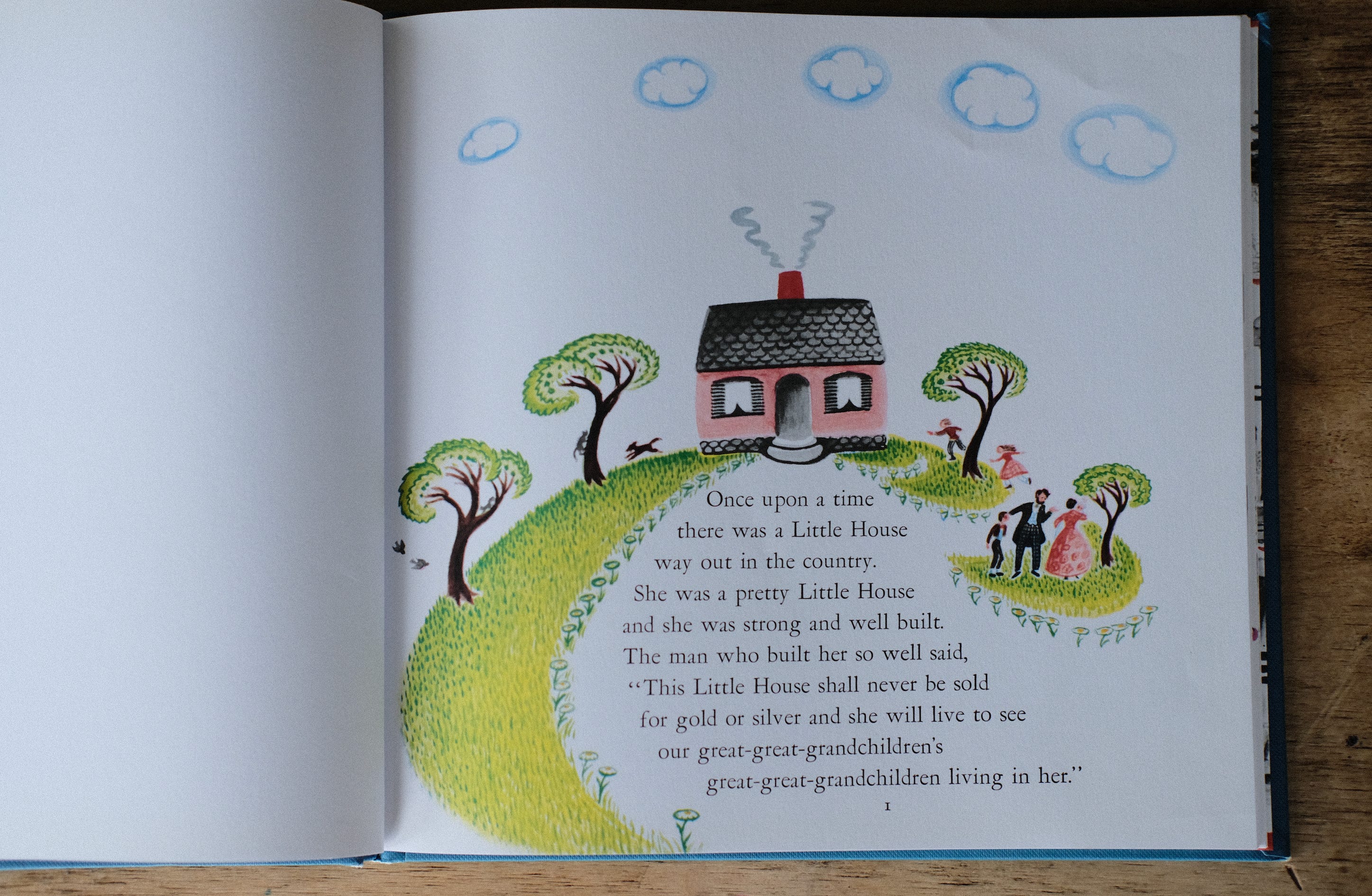
MAC: The transition from page 1 to this next spread, pages 2 and 3, is a big moment. She’s teaching us how the book will work.
In that first illustration, the family is big enough that they feel like characters in the story. You can even see the father’s eyes — the only time you’ll see human eyes in the book.
But this first full spread moves us to “house scale.”
The humans are tiny silhouettes and the house gets real emotions and real senses. “The Little House was happy as she sat on the hill and watched the countryside around her.” Burton is telling us in both the words and the pictures that the house is the character.
This is an old idea: Some of the earliest novels were “it-narratives,” stories about (and often narrated by) things: The Adventures of Shilling. The Secret History of an Old Shoe. History and Adventures of a Lady’s Slippers and Shoes.
But most “it-narratives” are about objects that can move around. They are also called “novels of circulation” — because the shillings and shoes get passed from owner to owner and take little tours of 18th-century London or whatever.
But although The Little House shares some of the social and economic concerns of classic “it-narratives,” it’s a trickier storytelling feat, because houses can’t move.
(Until they [SPOILER ALERT] do.)
JON: Right. Part of the suspense and fun of this story is watching things get objectively worse for this thing that has no way of making it better. You can’t see how this is going to end well.
MAC: And Burton makes it extra hard on herself because, for most of the story, she literally doesn’t move the house on the page.
Like, if you drilled through the picture of the house on page 3 you would drill straight down through the house on every page until 36.
(Don’t do this though.)
But one trick would be to show the house from different angles or to change the composition, but she doesn’t do that. She emphasizes how rooted this house is one place.
This emphasizes the change in the house’s surroundings — the picture book is like a series of time-lapse photographs.
But, especially if the pictures are static: How do you make us care about a building?
One way is to really personify the hell out of the building in text — to imbue it with human emotions and make it super relatable.
The most extreme example of this would be those preschool cartoons where the characters live inside a friendly talking house with googly eyes that appear in every room.
“Enjoy my play room!”
“Turn on my faucets!”
“My bathroom is down the hall!”
Grotesque stuff. Absolutely terrifying.
But personification can be done in really elegant and generative ways, too. Like take a look at School’s First Day at School by Adam Rex and Christian Robinson.

That book reinvigorates an old genre — the first day of school book — by having a newly constructed schoolhouse stand in for a kindergarten.
So, for example, the school has an accident: his fire alarm goes off, and “all the children exited and walked to the other side of the field and stared at him. He was so embarrassed.”

But Burton doesn’t really do this in The Little House. She gives us a little interiority or emotion on the house, but not much. And the stuff the house gets happy or sad about are “house things,” not people things.
The house is not an analogy for a kid or a parent or any other kind of person. She’s a house. The story has house stakes.
So instead of making the house more like us, she kind of turns us into houses.
Even though Burton gives the house “a face,” she’s pretty subtle with the house’s facial expressions, especially the changes in her emotions between spreads. This forces the reader to really lean in and look at the house, and sometimes do some real empathizing in order to decode a pretty blank expression. Basically, you have to imagine how you would feel if you were a house.
That static, repeated composition from spread to spread also makes the reader more house-like. The house does not move, but neither do we: we observe the house from the same position, stuck in one place for centuries.
And the book plays with our sense of time — we begin on human time, but in the first few pages, Burton moves us onto “house time.”

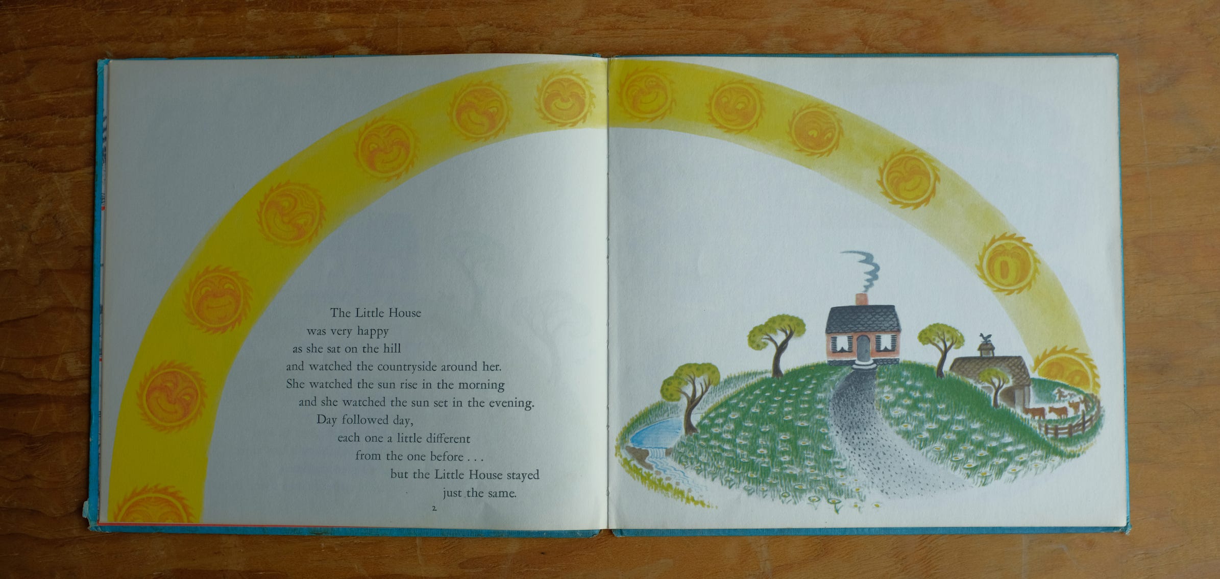
JON: Here in the night, we’ve expanded the horizon, but the house is still where it was, just a few hours later. This also is teaching us, in small steps, how we're going to read the book visually. It’s jumping ahead in time from where we started, but it’s the first time we do that, so it’s just a lil jump.
MAC: And now on the verso, the text side, the illustration is no longer part of “the main story” (a sun rising and falling over the little house), but a little decorative element.
So on page one, we saw a specific moment.
The illustration on the first full spread showed a single day.
But this spread represents one month.
JON: Yeah and the text says: “In the nights…” instead of “that night.”
MAC: And then we see a whole season pass in a spread:
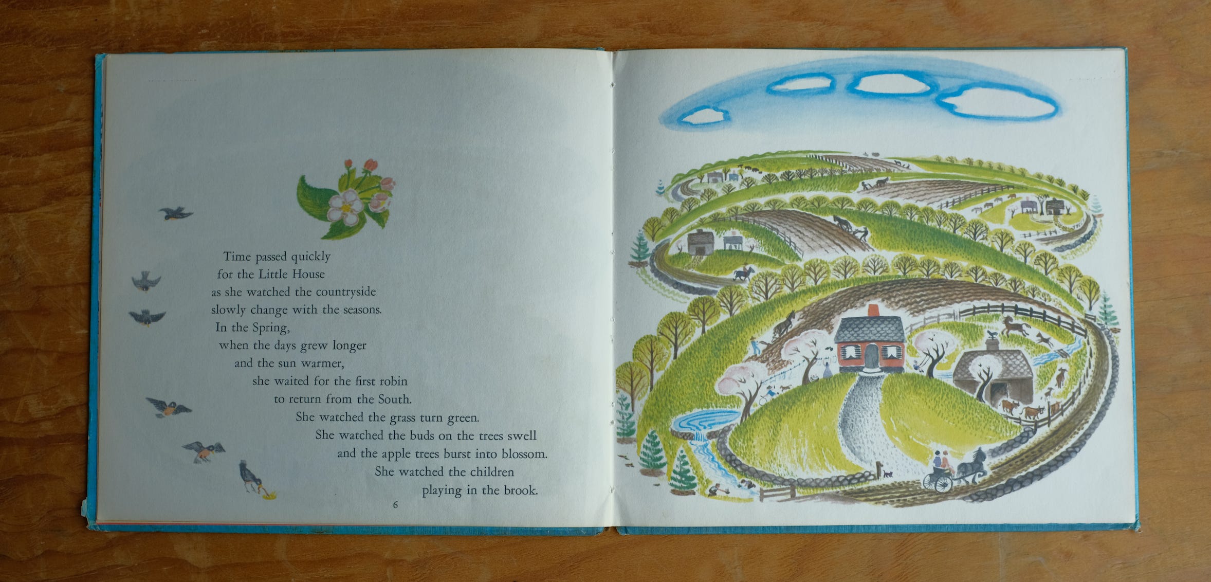
Spring.
The first sentence here does a really nice job establishing what Burton’s doing with time:
“Time passed quickly for the little house as she watched the countryside slowly change with the seasons.”
It’s very elegant, balancing “quickly” against “slowly,” acknowledging human time while rooting us in the house’s experience.
JON: Yeah, I don’t think she was necessarily worried about it, but I appreciate how it takes the stress off the idea that this character cannot move, and will not move, for years. Burton’s like, “Houses are fine. It’s passing quickly.”
MAC: “This is not a Sylvester and the Magic Pebble situation.”
JON: “Go somewhere else for that nightmare.”
MAC: “A minute for the Little House was exactly like a minute for you and me, and so she was doomed to experience time, unmoving, trapped upon the hill.”
JON: “It might even be slower for houses! We do not know. We cannot know.”
MAC: This is also the first indication, besides I guess the clothes of the family on page one, of the era we’re in. The previous spread tells us where we are —the pastoral, outside of the city. Now we know when we are: horses drawing buggies and pulling plows — we’re in the 19th-century.

The next three spreads take us through the other seasons. By winter, time has accelerated again (the text is doing the heavy lifting now):

“The apple trees grew old and new ones were planted. The children grew up and went away to the city . . .”
Those ellipses are Burton’s, by the way, and it’s pretty heartbreaking punctuation!
JON: Yeah. Like she doesn’t even want that sentence to end.
MAC: Yeah, and I think it’s particularly affecting when you read this kind of stuff as a kid. You cathect onto the children playing in the pictures — “they are me!” — and then those children grow old and leave.
It’s a little glimpse of what will happen to you.
And Burton is so delicate with that moment.
It’s very nicely done.
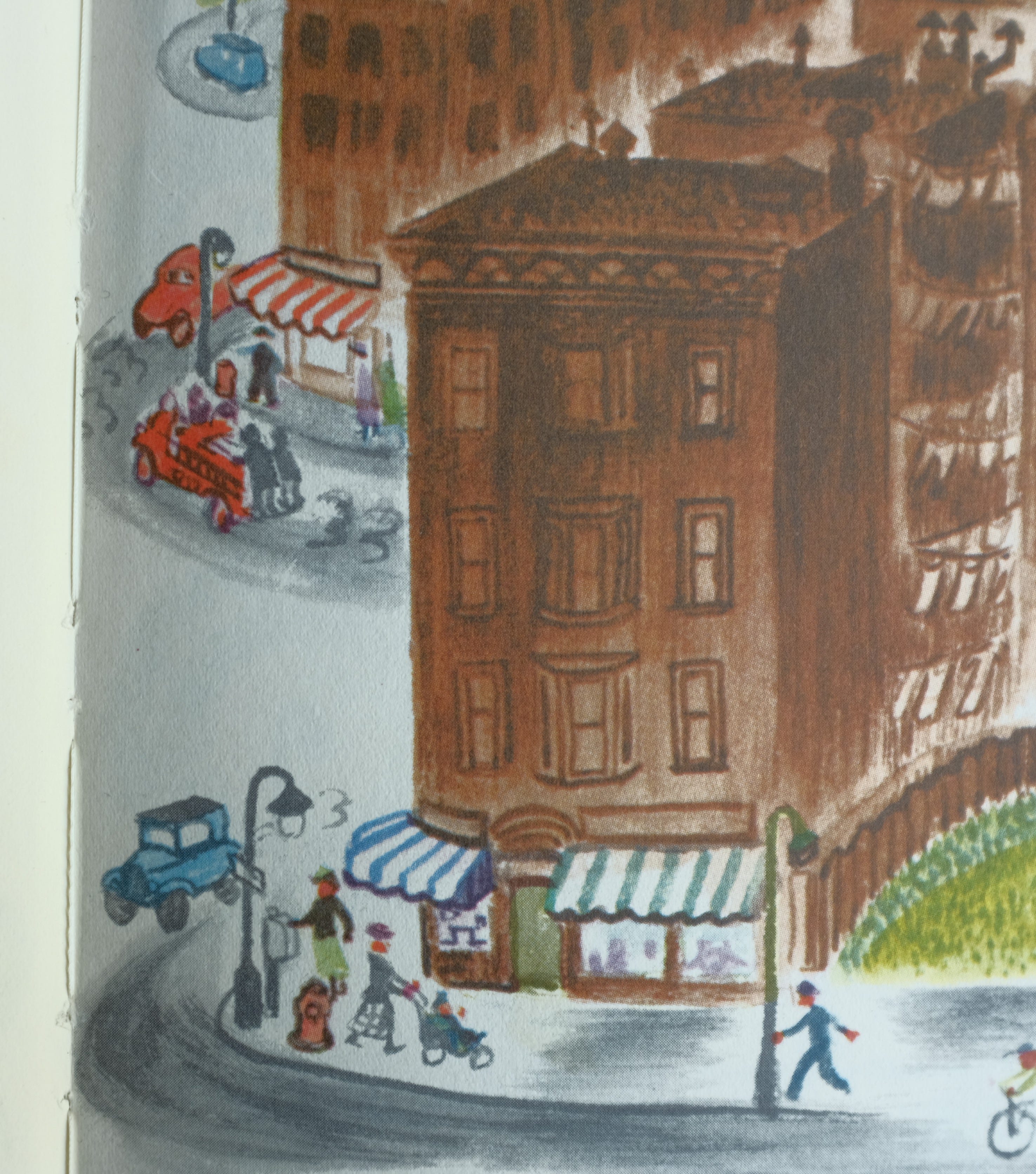
JON: Also, in the text the city seems to be getting closer, and in Winter is the first time in the illustration that we see a brown cloud coming over the horizon. It looks here, without context, like maybe a rain cloud or something, but this brown will become more and more dominant as the city gets closer.
MAC: And now at night the lights of the city seemed brighter and closer.
[Insert jawstheme.mp3]
The arrival of the “horseless carriage” signals epochal progress and the arrival of industry, and for the first time, the illustration on the right — the house’s environment — crosses the gutter.

Those two surveyors are over on the verso, planning to build.
JON: Yeah they’re not decoration. They’re really over there, relative to the house.
Like a couple of jerks.
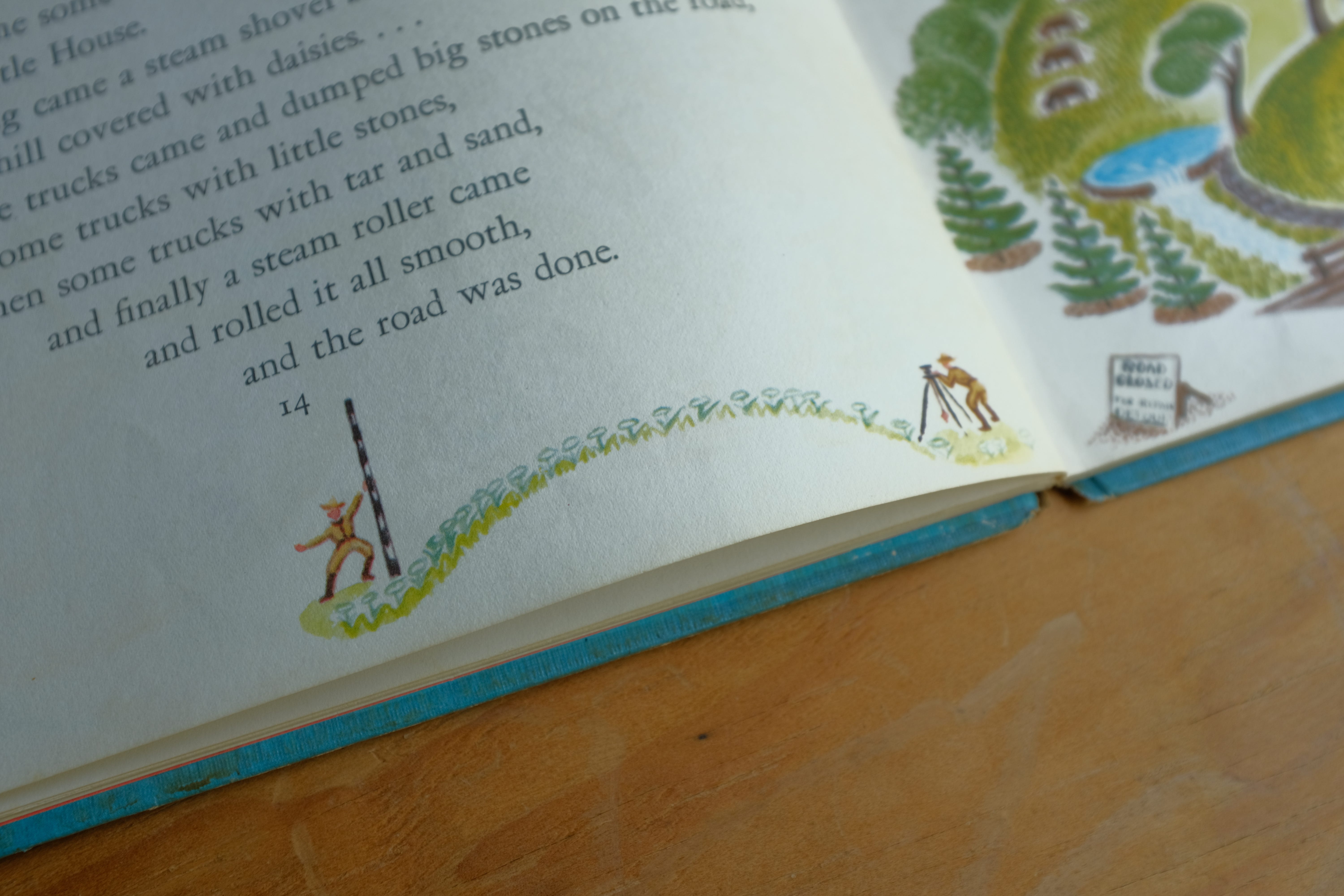
MAC: It’s a great trick. It feels like both an expansion (Burton needs more room to draw the world of the story) and an encroachment (these little guys are invading the area that was reserved for decorative folk elements).

And then here comes a bunch of rowdy people on an automobile, out on a double date.
JON: Also these new houses. No faces on these new houses.
And they all have fences. “Yards” have been invented.
A couple of those old houses with their barns are still back there. But they are not long for this world.
MAC: I think these houses do have faces, but they look like ghosts or zombies.
The face of house looking at death:
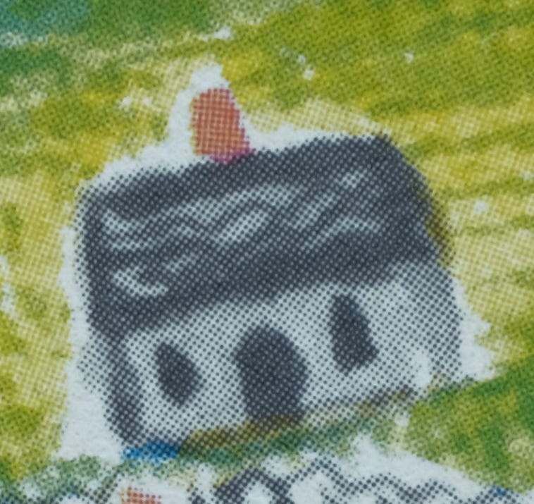
JON: He has seen The Void.
MAC: *She
JON:
Next page:

The suburbs don’t last long.
This page for me, is what clarifies Burton’s stance/the stance of the book. There was a way she could’ve rendered these low apartment buildings with more color, with more cheer. But she didn’t. She painted them all a dirty brown.
The house and its lawn got a little lost in the suburbs we saw one page back, but now they are an island of color.
MAC: Yeah, and I feel like these are the first buildings that don’t have faces.
JON: If Burton is hazy in any of her other books about whether progress is good/bad/inevitable, in this book, on this page, she's saying “this kind of sucks.”
MAC: Do Twitter urbanists hate this book?
JON: Sound off in the comments we will NOT wade into!
MAC: Half the tweets I see are like,
This mixed-use building has ground-level retail, housing for 15 families, plenty of bike storage — and it came in under budget:
JON: Burton’s reaction:

MAC: This is also the spread where the family moves out. “No one wanted to live in her and take care of her any more.”

JON: Oh, maybe that’s the last group who lived in the house out front here! I always just thought they were a random family walking by and the lady is saying something like: “Oh that looks just like the house my grandpa had. Anyway, let's go to Macy’s.” I don't know if I ever registered that, but maybe that’s the family leaving.
MAC: I think it is.
This is sad for the house, but also I will say that by this point I really haven’t been keeping track of the family — I stopped caring about the family somewhere in the seasons spreads. The dramatic concerns are now about zoning and real estate: “The countryside was divided into lots” is not really a line you expect to see in a picture book.
JON: I do like that. That a frown would appear on a small child’s face: “Divided into lots . . . sounds bad.”
“They should probably keep an eye on some of the water rights, right, Daddy?”
Meanwhile, our sense of time is really moving quickly now. We’re in full “house time” mode. Generations are being born and dying at a furious pace.
MAC: Yeah, the father who built the house has been dead for like a hundred years.
But his declaration still stands: the house “couldn’t be sold for gold or silver, so she just stayed there and watched.”
Narratively, obviously, we need the house not to be sold for gold and silver, and there’s maybe some underlying capitalist critique, but, like, why can’t the house be sold for gold and silver?
JON: Well firstly because the country has moved into a different currency system.
MAC: A banker arrives, twisting his mustache.
“I know about your great-great-grandfather's dying declaration — everybody knows about it — but I have good news for you: the United States has moved to a fiat currency.”
JON: “We can honor him and ALSO be RICH.”
MAC: Well for whatever reason the family moves out but doesn’t sell the house and the city keeps growing.

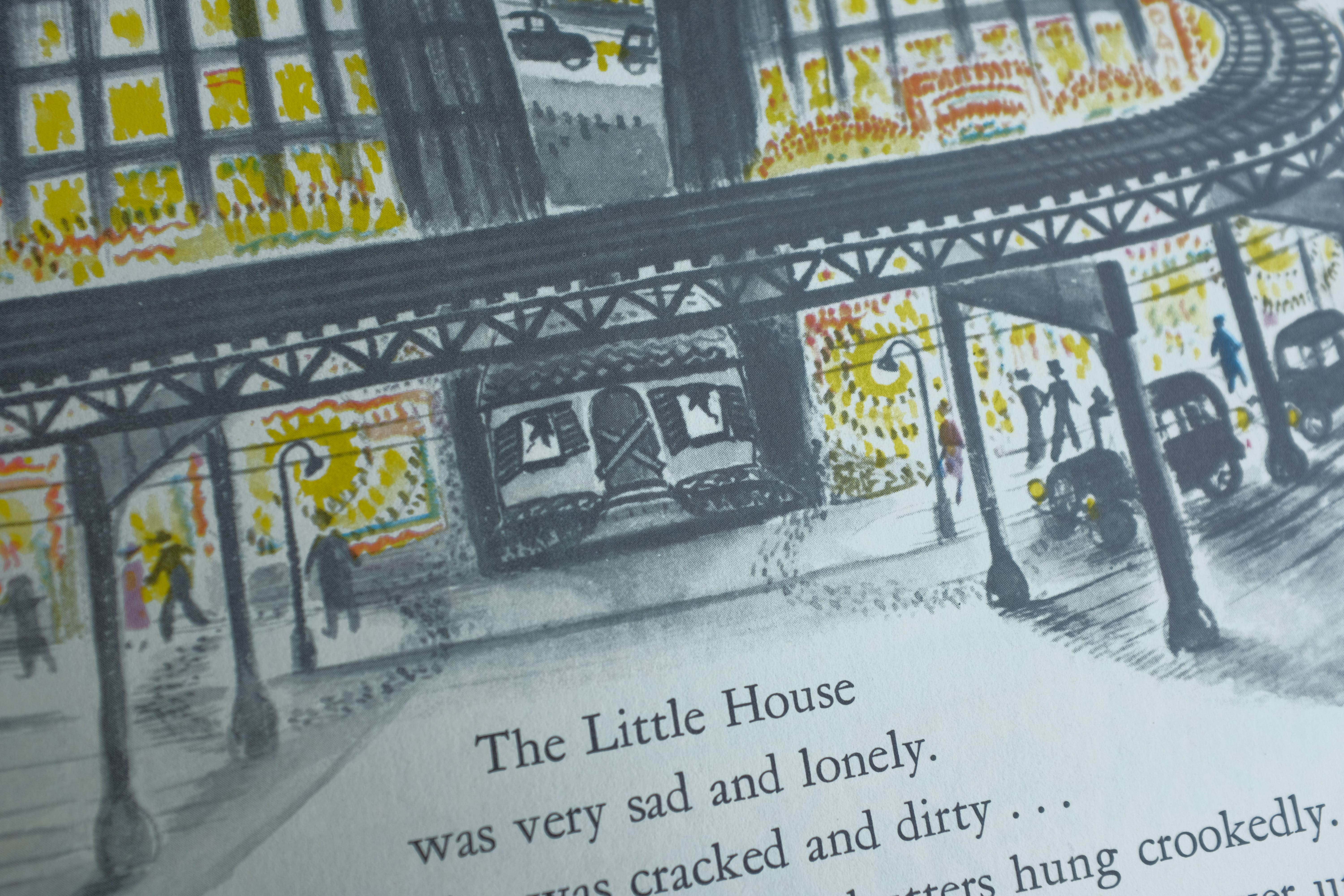
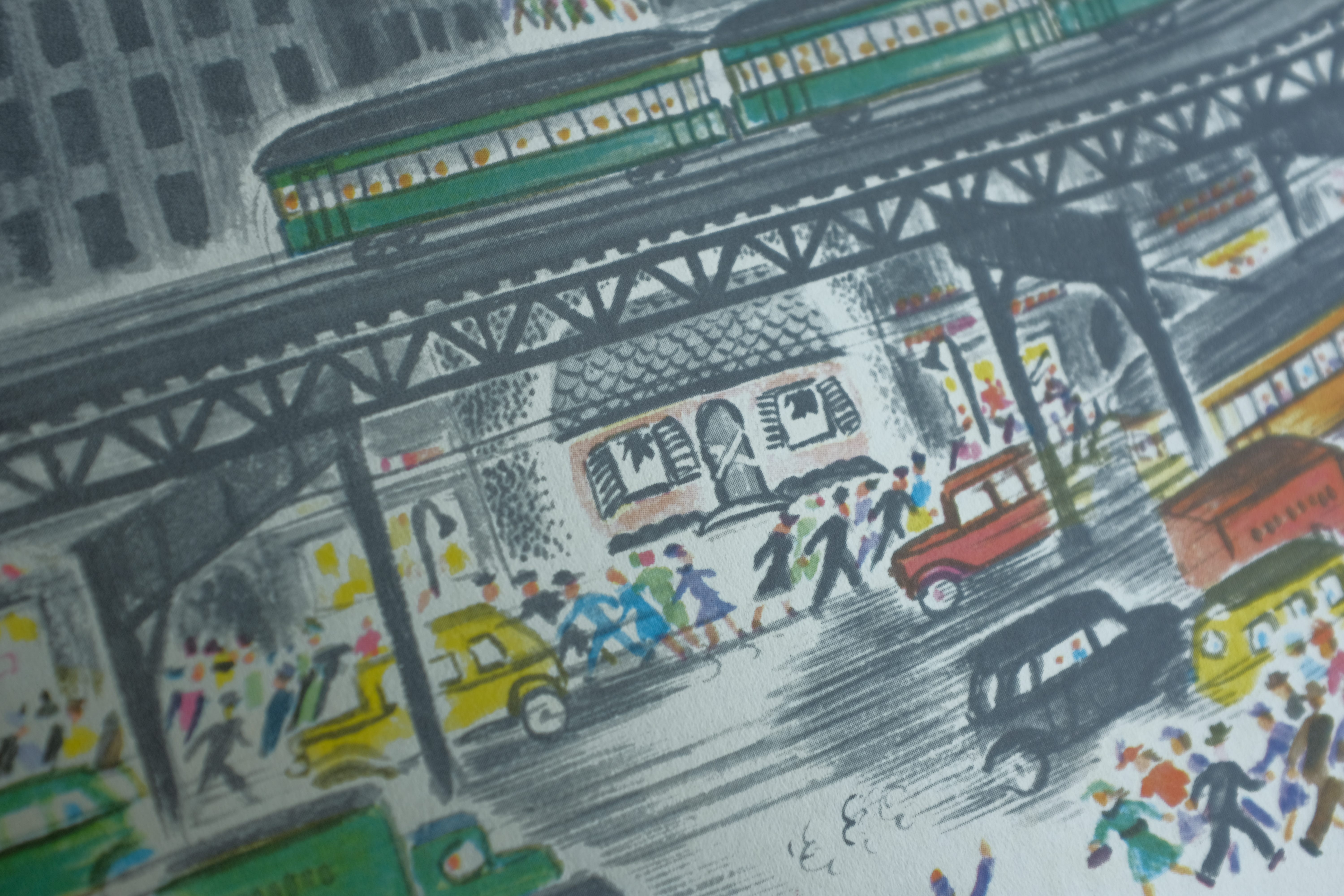
JON: The elevated train getting put in now always came as a quiet shock to me. Like, it’s cool, for one thing. Trains are cool. But it’s a whole new speed than we’ve seen, everyone’s running now, not just walking, the lines in the drawing get faster and longer, it’s like the city has started literally spinning. Also it’s the first time it begins to obscure the house from our view. Even the person making the book isn’t able to keep the house safe anymore, visually.
And the cloud overhead has turned into an oncoming blanket. It’s not even dark individual clouds anymore. It’s the sky from Ghostbusters.
MAC: Yeah, and the trolley line blocking the house feels jarring and upsetting — I think more emotion comes from the obscured view than any change in the house’s “facial expression.” There’s not a big sad face here — just, maybe a slight straightening of the line on those stairs.
Most of our feelings in this book arise from changes to the built environment.
There’s a neat trick in the writing that starts on this page, too.
The next four spreads all start the same way: “Pretty soon.” Burton’s jumping us forward through huge stretches of time with each page turn — we see decades’ worth of infrastructure being built — while insisting, with a colloquial expression, that this is all happening fast, in moments.
We're fully on “house time” now.
Maybe even on “city time.”
JON: RIGHT. Thaaaaat’s interesting. We thought the only trick was going to be that she slowly gets us into “house time,” but actually the sense of time just keeps speeding up, past the house, which is the point.
MAC: And then she breaks this hurtling forward through time by saying “Now”:

“Now the Little House only saw the sun and noon, and didn’t see the moon or stars at night at all because the lights of the city were too bright.”
And I feel like the grid of that skyscraper recalls (and has replaced) that lunar calendar from page four.
Still, Burton is so restrained.
The house looks really bad. It's fallen into disrepair between the last spread and this one.
But all the text says is: “She didn't like living in the city.”
It’s heartbreaking — the understatement of those words juxtaposed with the crumbling house.
JON: This also is kind of where the limited personification of the house pays off, too, though. If Burton had made the house more alive, with more expression and more of a face, you’d feel some hesitation about doing what she does to the house here. It would feel more like a graphic death. But because our way in was always limited, you can have it feel like a death without so much trauma to the audience.
MAC: There is an X across the front door!
It’s brutal.
Disney Pixar's UP! could never.
Yeah, yeah, the old man lost his wife in the opening montage, it’s very sad.
BUT WHAT IF HIS HOUSE WAS BOARDED UP?
JON: Have you ever killed a house that couldn’t move its whole life.
MAC: It’s an unbearable moment, and Burton knows it, because she starts to provide relief on the next page.

As soon as you turn the page you get all that lively color, which is provided by people — humans — wearing bright clothes.
It’s the first time that humans have felt like individuals since the city was built.
And the text knows it’s got to lift us up out of the ditch we were thrown into on the last spread, and gets right to work, slowing down time to focus on a hugely significant single human moment: “Then one fine morning in Spring along came the great-great-granddaughter of the man who built the Little House so well.”
She’s like, “Wait a second, I think I own this house . . .”
Salvation!
The house still looks pretty messed up though.
JON: A weak “hooray” escapes the house-mouth that Burton never quite drew.
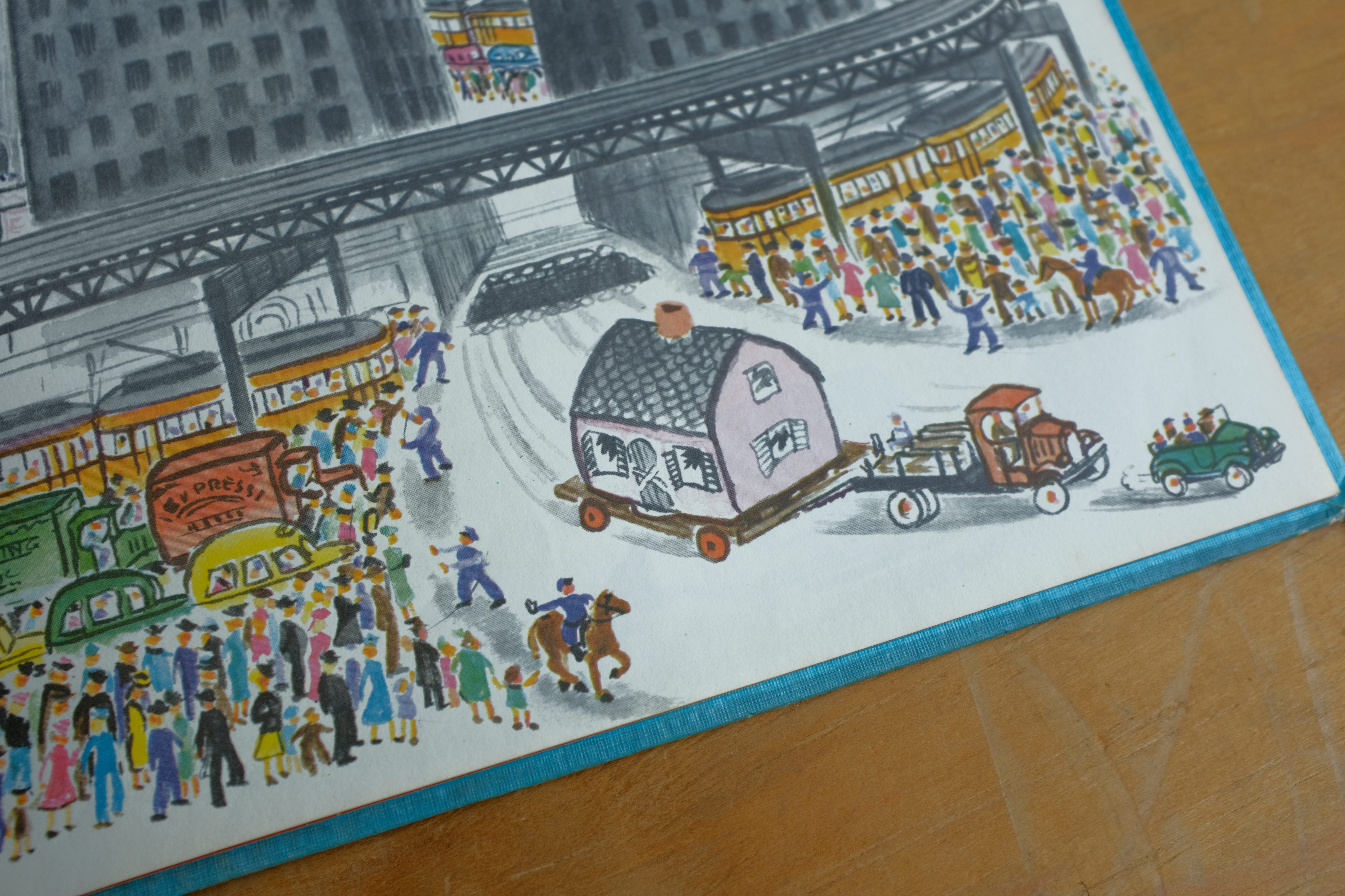
MAC: And then, repeating the same composition for like 90 spreads really pays off because —

The house is gone!
JON: I love the pacing here too. She doesn't build up to it, visually, draw it out all proud of herself and the move she’s about to make. You just turn the page and the house is on its way. Being carried off, by the way, by older trucks and cars. The vehicles in the city are more rounded now, the way they got in the late 30s and 40s. The ones that are taking the house away still kind of have that earlier Model T thing going on.
MAC: Although the house still looks pretty messed up.
JON: “Hoorraaayyyy….”
Whatever would stand in as house-blood leaving a trail down the street.
I also love that they’re holding up traffic for it to go by, but barely. Like the red sea is about to crash down again as soon as the house is through, nobody is going to bat an eye. They aren’t sad. This isn’t a parade. The house is anonymous.
MAC: And for our friends writing PhD theses on the economics of The Little House, this is a very funny thing to write on the side of a truck that is clogging the streets:

“USELESS GARBAGE FOR STORES.”
JON: “THE PROBLEM.”

MAC: A couple really nice design tricks here:
For the first time, the house on the left side of the spread.
And the text is laid out like the house’s winding path out of the city.
JON: It’s so happy. It’s like the indentation is a dog being let out of the car into the country after the long drive.
Just bounding around.
MAC: House wellness check:

House is looking a little better here.
Still messed up but smiling.
JON: “I can smell grass.”
MAC: “Nice family, who I assume has the telephone number of a general contractor…”
JON: “I can’t SEE anything. My ‘eyes’ are still swollen shut.”
MAC: “Is somebody going to take these boards off my mouth?”
“The dead “X”/grave marker boards?”
JON: “The ‘DEAD HOUSE’ symbols? Yes?”

MAC: Yes!
The house is back on a new hill, the text describes her restoration. The Raisin Bran sun has returned, and for once he is not overacting.
He is like, “How is the house doing?”
JON: “Ohhhh yeahhhh.”
In the Kool-Aid man voice for some reason.
MAC: “Does a body good.”
In the Kool-Aid man voice.
JON: All the seasons are back too, under the text.
Seasons exist again.
MAC: And the moon.
JON: Yeah. She’s really going for it. “Life is here, and here only.”
MAC: There is so much going on the left.
And on the right:

Burton has let go of the reins, emotionally.
The house is smiling.
The lawn is smiling.
A guy is using a push mower to mow a smile into the lawn.
JON: Dogs, cats, birds, children, a fire in the fireplace in the middle of a warm day, lawns being mowed, just all out.
Even the first time real shadows are cast by the Kool-Aid man sun.
She was saving that.
MAC: Burton’s really earned this moment. All her previous restraint makes us feel this emotional moment so intensely. It’s like The Remains of the Day.
And a lesser storyteller would end with this moment, but she dials it down again on the last page:

Very relatable impulse.
“Was that too happy? I think that was too happy. Too tidy.”
“I’m just going to keep the book going.”
JON: “That will fix it.”
MAC: Ellipses flying on the last page…
She just will not end it…
The end…
The…
End…
…
JON: …
I love this, I absolutely love the close readings, they are my absolute favorites of all the emails to show up in my inbox ever. (More please!)
I love the Mary Anne the steam shovel cameo. Stealth marketing!