This week we want to highlight some of our favorite reader comments. There’s been a lot of rich conversation in the comments section, stuff that’s really deepened and complicated our understanding of the books we’ve been looking at.
Jon and Mac had this conversation over text.
MAC: Hi, Jon.
JON: Hi, Mac.
MAC: The first comment is from Annie Barrows, on our Where the Wild Things Are post:
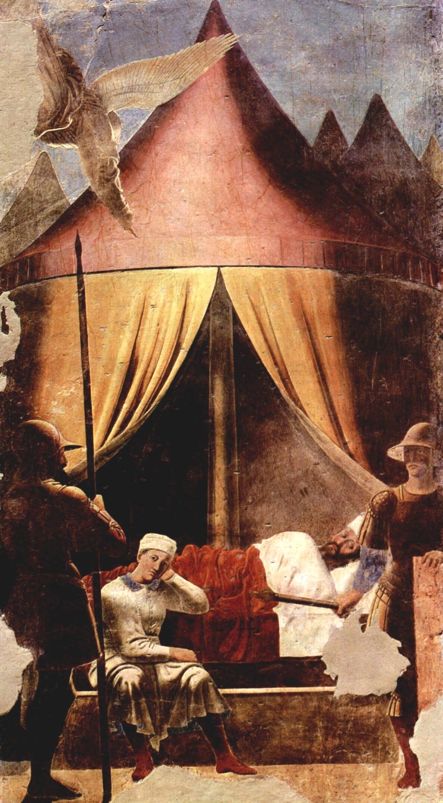
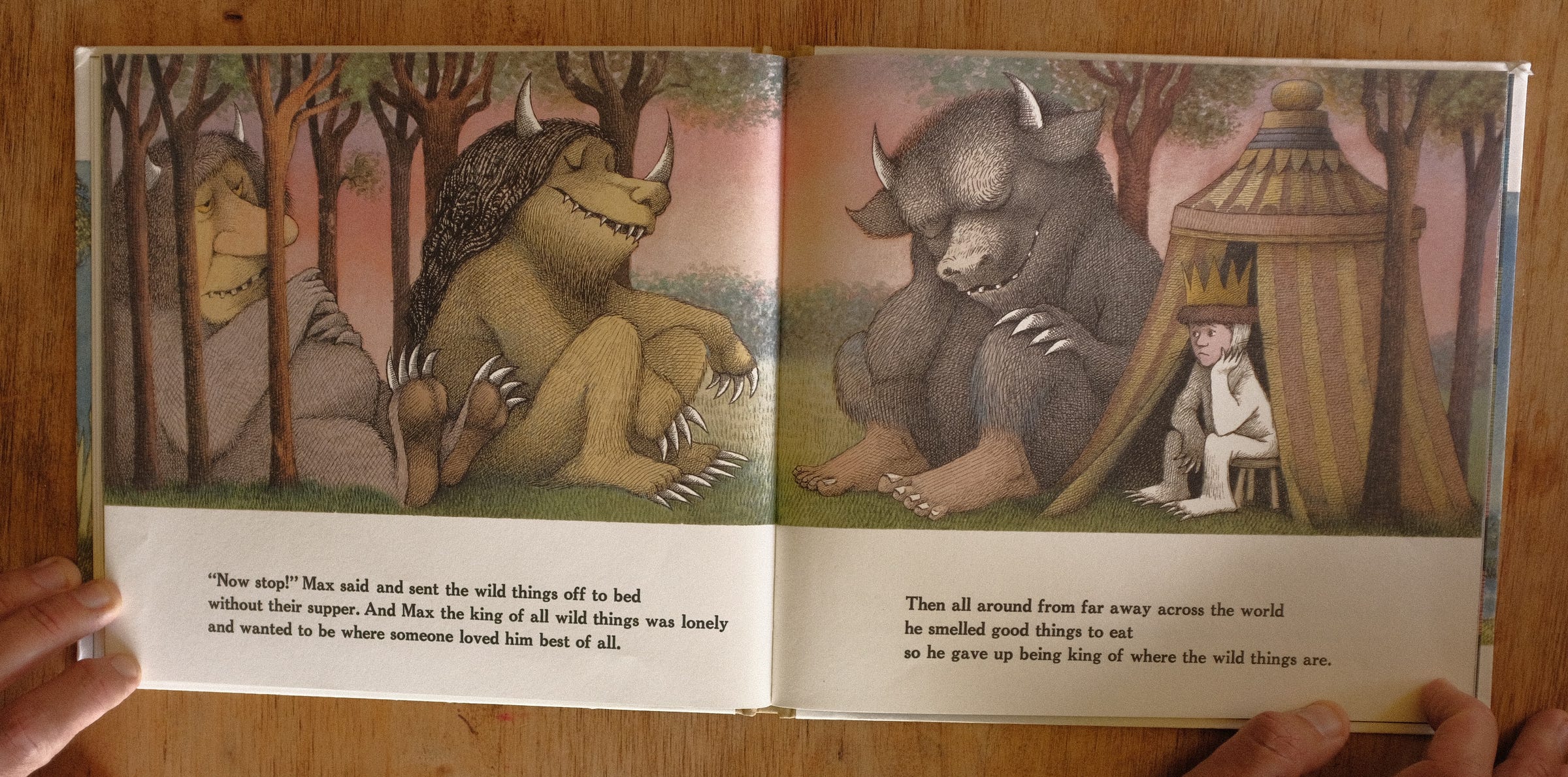
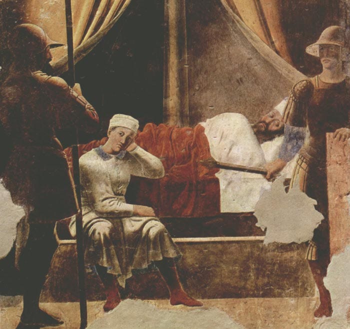
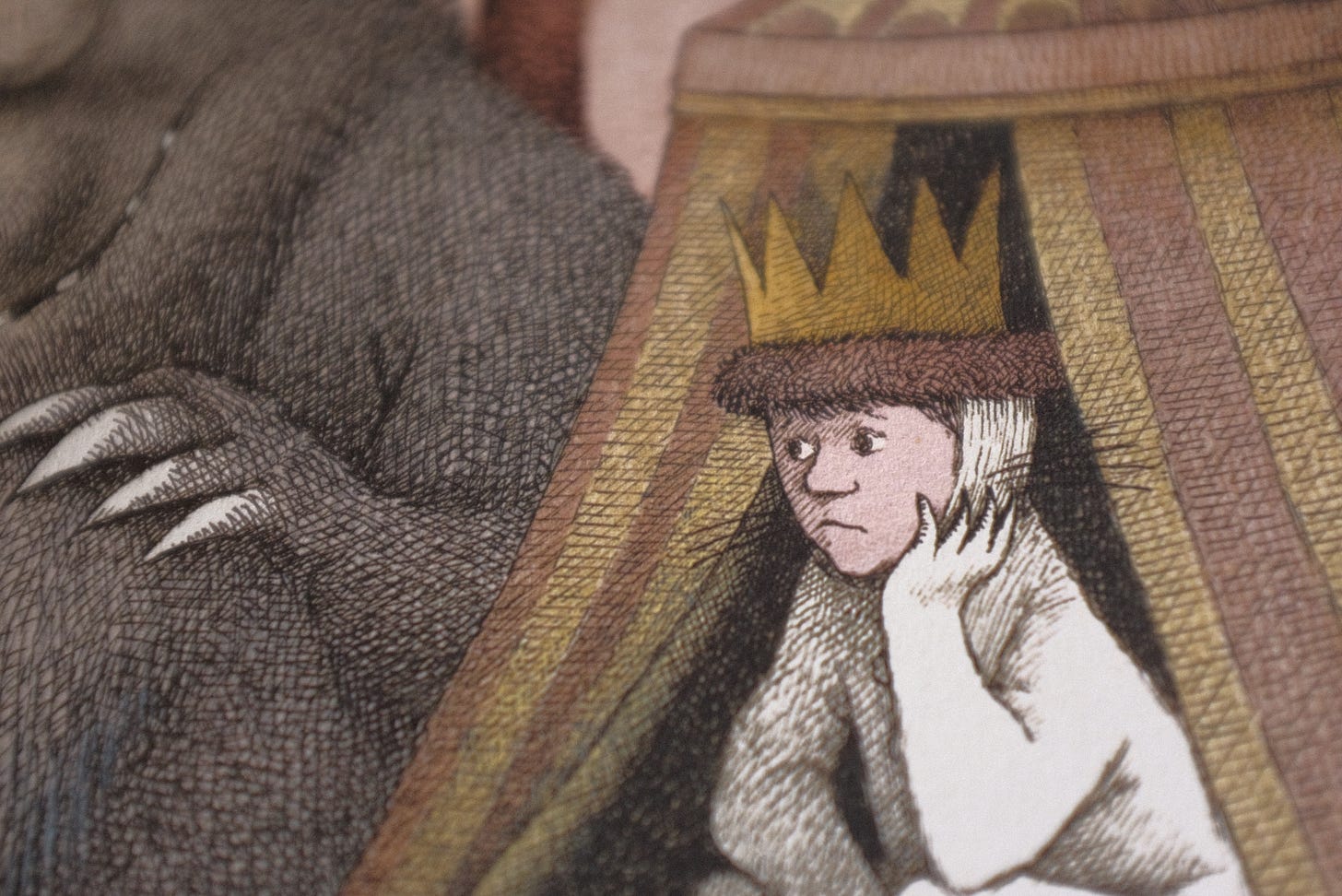
Annie Barrows: Hey you guys, to further your theory about the transformational quality of the moment when Max becomes his mother by sending the Wild Things to bed without their supper, check out its similarity in palette, mood, and (a little bit) composition to Piero della Francesca's Dream of Constantine fresco in Arezzo. To me, it's remarkable. Annie.
MAC: We happened to be eating dinner together when we saw this comment. We looked up the painting right there at the table and then lost our minds.
JON: We really did kind of lose it then and there.
MAC: “Dream of Constantine” depicts a religious vision the Roman emperor had on the eve of a great battle. An angel, who you can see descending in the upper left, tells Constantine to fight under the banner of the cross, rather than the Roman eagle. Constantine did, and then he won, and then he converted to Christianity — the beginning of the Christianizing of Rome.
JON: Basically Where the Wild Things Are.
OK, not really.
MAC: But it is a “transformational moment” in Where the Wild Things Are. This is when Max changes his mind and decides to return home.
It’s interesting that Max is not Constantine in this illustration. (In the fresco, Constantine is the guy who’s asleep.) After all, Max is a king who is undergoing a conversion. But Sendak copies the pose and expression of Constantine’s bored servant.
JON: When I saw this fresco, my takeaway was to just think how great it is that Sendak had buried this image, this pretty obscure image, in his mind and potentially built a book around repurposing it. It fits the book completely — you could argue it makes the book. It’s almost like he dreamt up the book around his memory of the original picture.
MAC: Sendak had a deep knowledge of art history. It’s always interesting to situate picture books within the wider arts, though the tendency is to fence them off like some kids-only playground. Picture books are fed by painting and music and theater and dance. Studying other disciplines helps us read picture books better — and write them better, too.
JON: Yeah, so many of our favorite people, especially older ones, had huge interests in other areas of art that informed and fed their book work. It’s a good lesson to take.
MAC: So thanks for studying Piero della Francesca's Dream of Constantine, Annie, because we... hadn’t.
MAC: Here are a couple of comments we particularly enjoyed from our Millions of Cats post:
Tamson Weston: I just went down a Wanda Gág rabbit hole, and it was so much fun! It would be interesting to get some production insights about this book as well — I think it might have been impossible (or near) to typeset the text around the illustrations (?) when this was published, hence hand-lettering, and while there was four-color separation in the early twentieth century, it was probably something that kiddie publishers wouldn’t spring for.
JON: This was such a great thing to learn because what it meant was that Wanda Gág wasn’t just seeing new storytelling opportunities because of a new technical breakthrough on the printing end — she was forcing it through before they even knew how to do it.
Even the former would’ve been revolutionary, but she was bending the whole thing to her will that much more.
MAC: Right — she had a vision of how the words and pictures would interact physically on the page and figured out how to circumvent the limits of technology.
When you’re constructing a picture book, it’s very important, to think about when the words come, and what pictures they're sitting next to — but you don’t really see that kind of care, pre-Gág.
JON: I'm trying to think of an equivalent for, like, movies, and the closest thing I can think of is when they would play live music along with a film screening before the advent of sound. Like they knew they needed it, but the technology couldn’t do it yet.
MAC: I wonder, if she had the technology, would she have still wanted the hand-lettering? Or would her brother have been out of a job?
JON: Yeah. She kept it for a long time after that, right? And it does fit the look so well.
MAC: NICE SEGUE, JON.
JON: SHHHH DON'T SAY THAT. I'D DONE IT SO GOOD.
Ariel Dovas: Great conversation, love to learn what you two see when you look at these books. I wonder about the clouds as well. Special care seems to be put into making sure they have their place on the page. It also makes me think of the tiny house on top of a rolling hill, that’s also a recurring scene in picture books. Her line work all over is really great, for sure an influence on Crumb and the like.
MAC: First of all, we really liked the first part, where Ariel compliments us.
JON: Yes, we'll take all of that you got.
MAC: But we also liked the stuff about the clouds, and especially his point about the recurring image of a house on a hill in picture books.
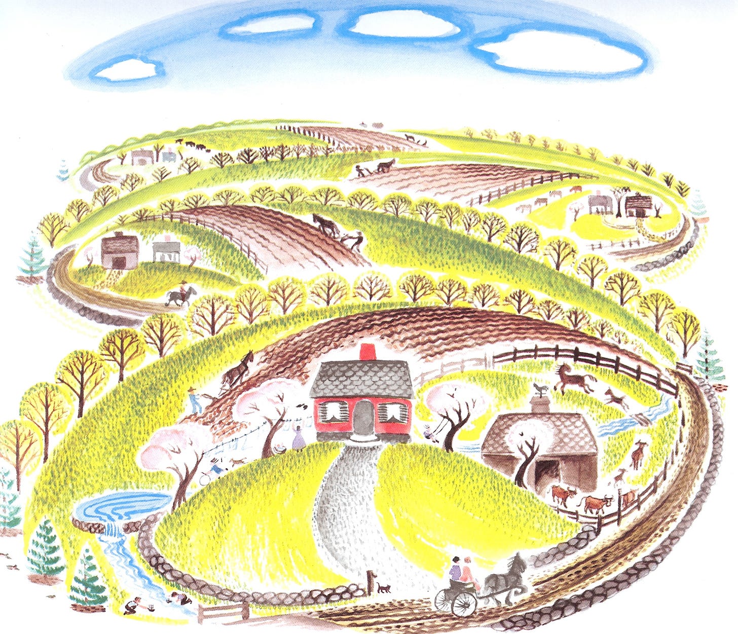
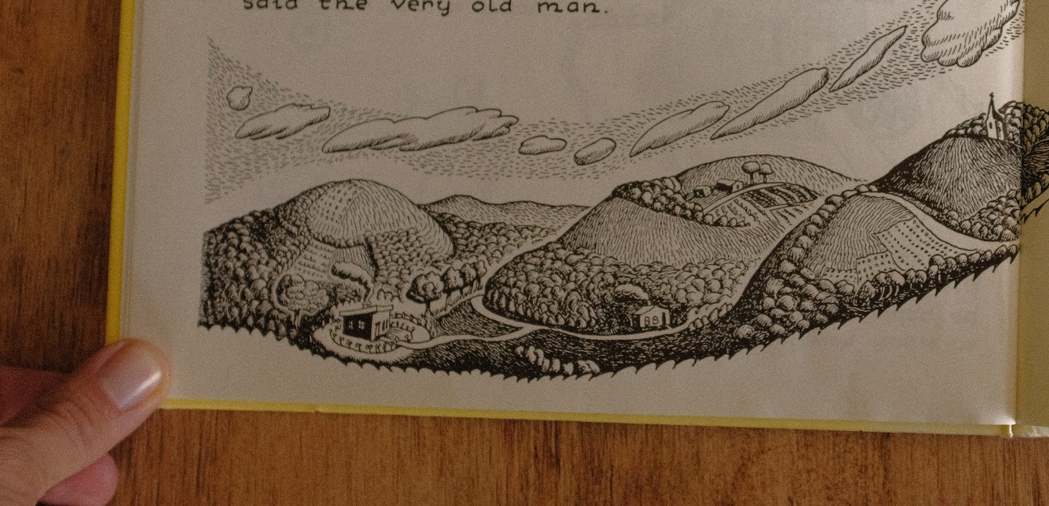
JON: There is a cool connection here! Albeit a loose one, but still, it's there. My assumption is that Ariel is at least partly thinking here about Virginia Lee Burton, particularly her book, The Little House. Burton was a few decades after Gág, but there is definitely some overlap, stylistically.
Here’s Burton:
MAC: And here’s Gág:
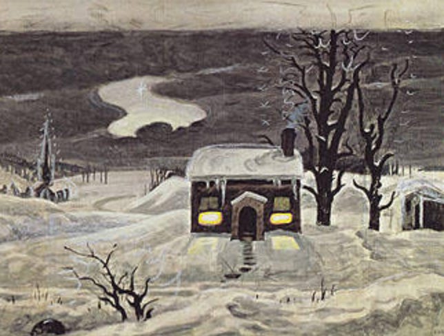
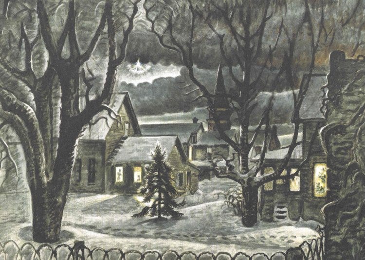
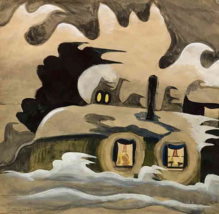
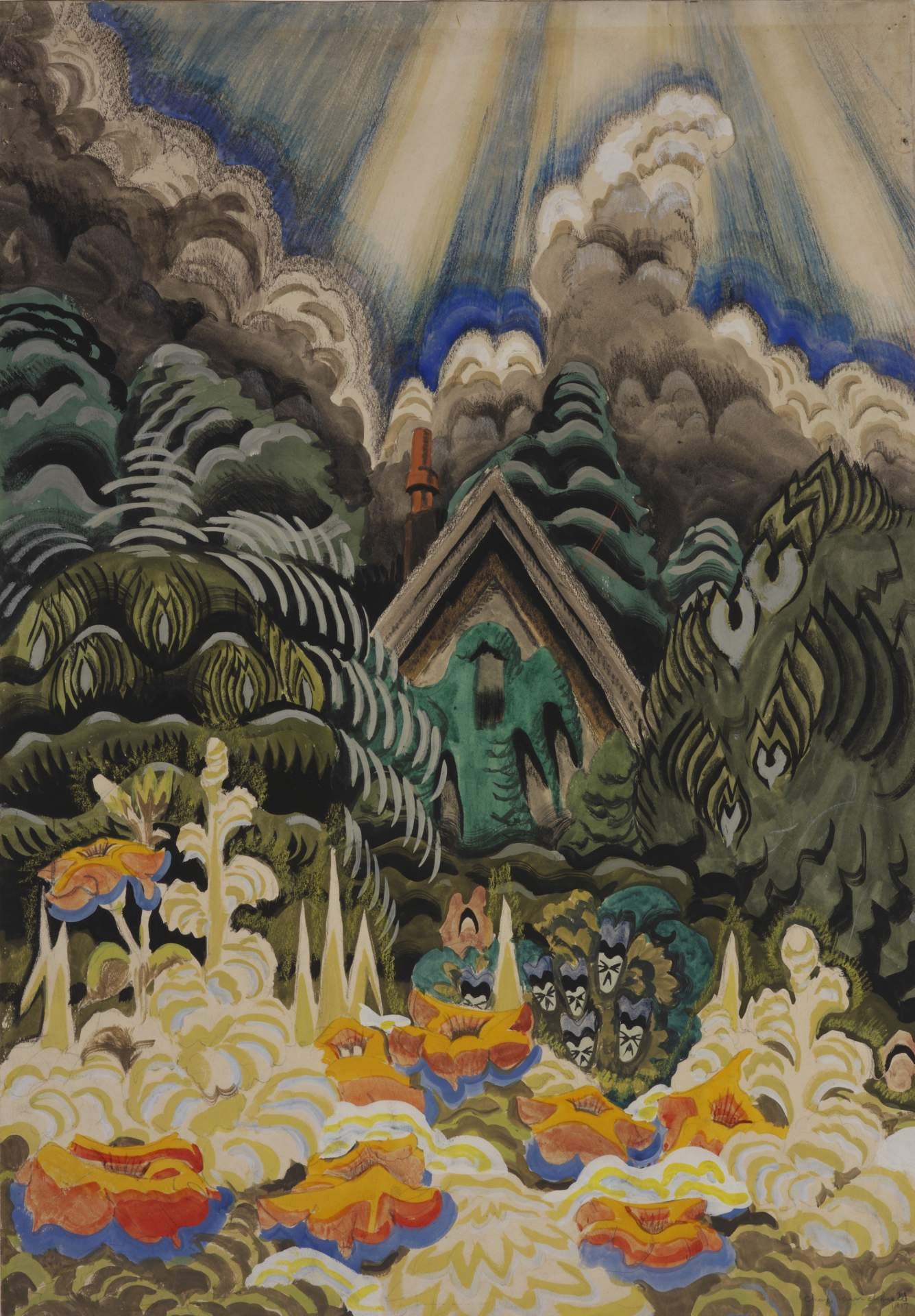
JON: Interestingly, one of my favorite painters, Charles Burchfield of Buffalo, NY, was born the same year as Gág, and I think they were likely fans of each other, and I think Burton was into both of them.
Here’s Burchfield, who painted a lot of winter upstate New York scenes:
Here’s Gág:
Burchfield:
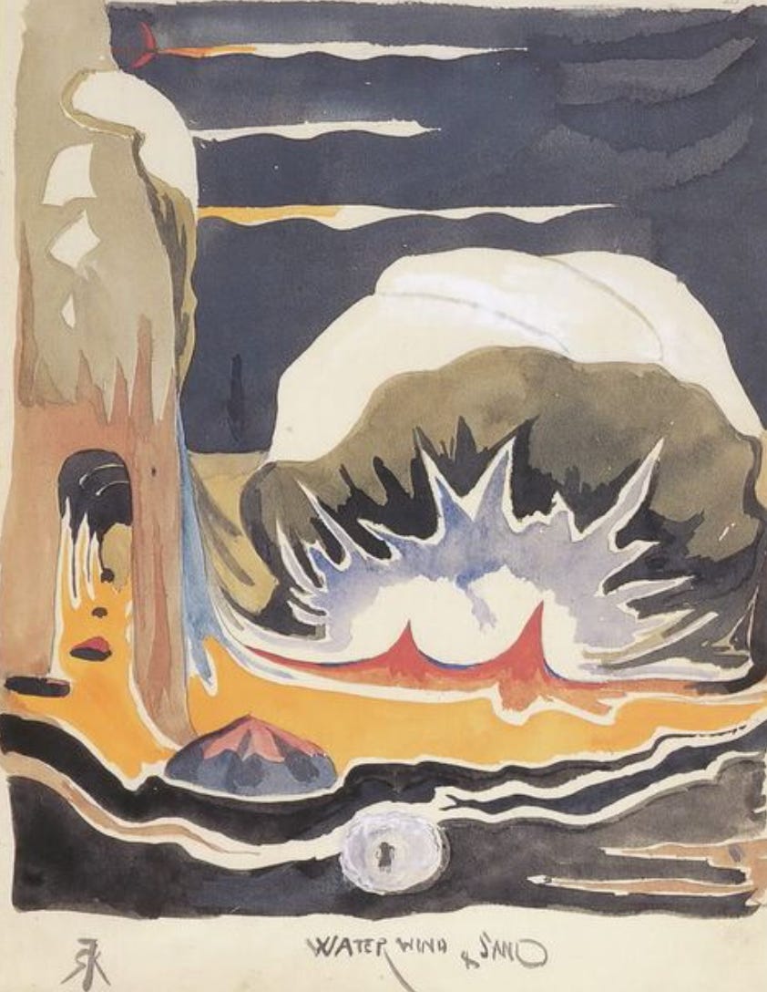
ALSO worth noting — maybe this is known in a more academic way somewhere — but Burchfield got pretty weird sometimes, and I always thought the weirder stuff was profoundly influential on Theodore Geisel (aka Dr. Seuss), especially his early work.
Here’s more Burchfield, being weird:
And now Geisel:
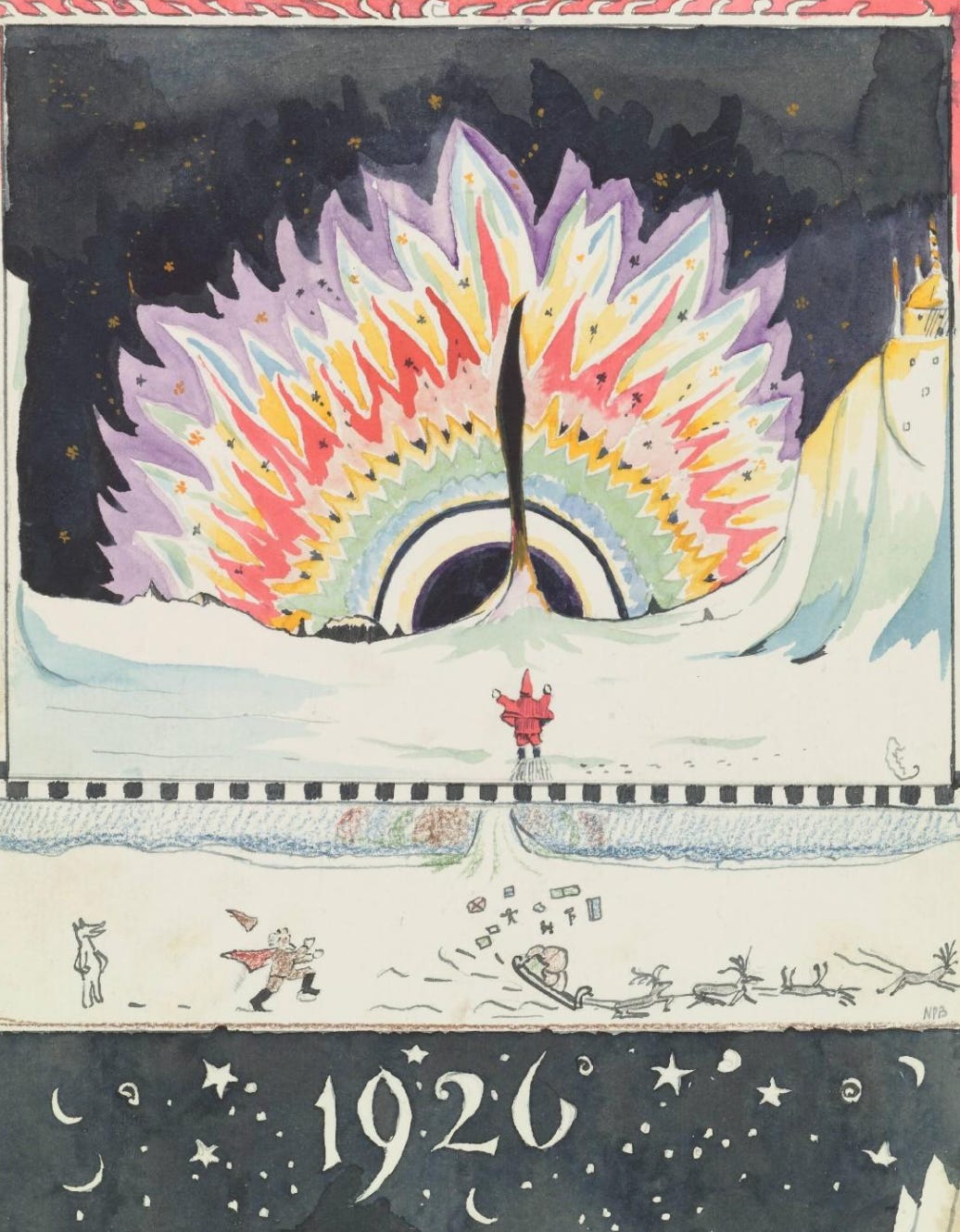
Oh, oh, ALSO, there’s Tolkien, who was only one year older than Gág and Burchfield:
Obviously, there are differences between all of these guys, but there’s also some overlap, and it’s so cool to think about everyone working at the same time, whether they were seeing each other’s stuff or not.
MAC: And there were a couple of great comments on the Shortcut post about (unsurprisingly) typography:
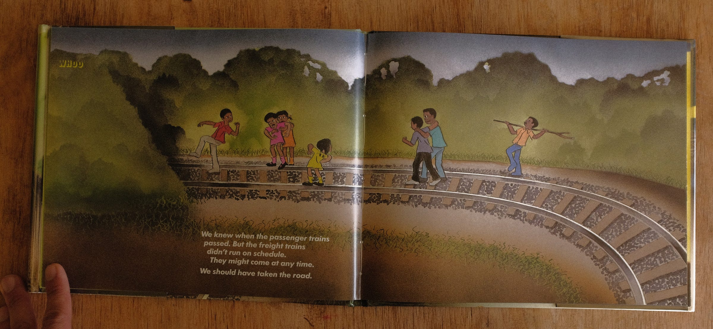
Michelle: I love the way Crews uses the 'We' and the typeface not just to show the collective decision, but as part of the design too. The first spread where they are making the decision, the lines of text move left and right as he changes the indent, almost as you would look left and right and all around before choosing your path and setting out. Then for the rest of the story each line is slightly indented and he uses the w in 'We' at the beginning of many lines with the increasing indent to emphasize moving forward, except in the moment of indecision - "We should have taken the road" where it is positioned without an indent, and in the very last line, where the position and slope of the A in "And we never took the short-cut again" completely contrasts the direction of the preceding indented lines, all starting with W. Very cool to see the typography incorporated into the design of the graphic spreads in this way.
Michelle notices something very cool — each line in the story is slightly indented, so the block of text moves forward, except when the narrator hesitates or expresses regret — then the line moves back to the left.
JON: AAAAAaaaaaaaa.
MAC: And from Carla:
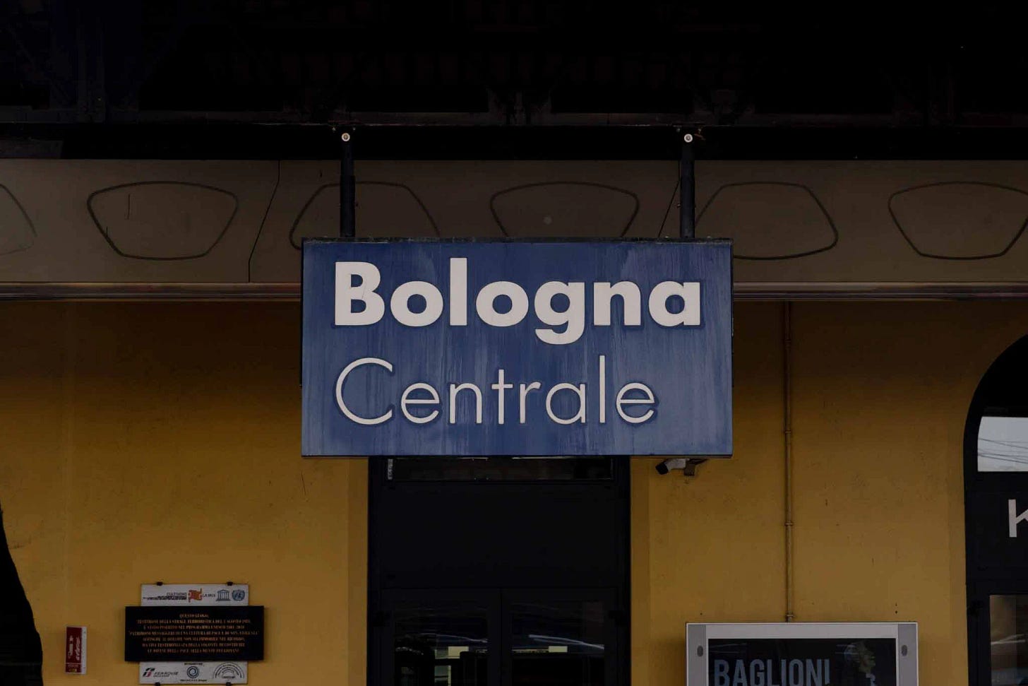
Hey guys! Do you know that the FUTURA font (which is German) is the one used by many railway companies for their signs and communication? I think Donald knew...
JON: Man, that is some “one set of footprints” stuff.
MAC: Carla is right. Yeah, Donald knew.
We left that out earlier, when we were talking about all the arts feeding picture books. The arts and trains.
Finally, Leo Espinosa linked to something very cool in our Halloween Picture Book Recommendation post:
Leo Espinosa: just found this terrific filmstrip adaptation of "A Woggle of Witches". I still need to get the book to see the complete illustrations.
Sound filmstrips, I learned from the video’s YouTube description, are “a still-image presentation format distributed on 35mm film that was used in the 20th century in education, business, and industry.”
JON: Thank you to all our great and very smart (and overwhelmingly polite) commenters. We’ve been so happy to see the depth of knowledge out there on this stuff. We’re learning a lot. <3








Love all of this. And Jon, I can't help but think about you and THE SKULL with Sendak the fresco and WILD THINGS.
We go to the Art Institute of Chicago a lot, and one of the ways my 4yo gets into it is by thinking about "which piece of art [book character] would like best," and -- and this is so obvious, I feel silly -- now I'm excited to prompt him to find art that reminds him of illustrations in his favorite books. (And maybe I should do some research, too.)
Mind blowing stuff. I can't thank you enough for offering this ... insight, conversation, education, geek-out, ... whatever it is, I've been waiting for it. Thanks!!!